Image Grid Exercise
IMAGE GRID
For this next part, I will post all the code, but don't feel like you have to write out the code yourself, especially because you won't have access to the images I'm using.
Here are my HTML and CSS pages
<html>
    <head>
        <link rel="stylesheet" href="index.css">
        <link rel="stylesheet" href="style.css">
    </head>
    <body>
        <div class="container">
            <div><img src="img/normal1.jpg"/></div>
            <div class="vertical"><img src="img/vertical1.jpg"/></div>
            <div class="horizontal"><img src="img/horizontal1.jpg"/></div>
            <div><img src="img/normal2.jpg"/></div>
            <div><img src="img/normal3.jpg"/></div>
            <div class="big"><img src="img/big1.jpg"/></div>
            <div><img src="img/normal4.jpg"/></div>
            <div class="vertical"><img src="img/vertical2.jpg"/></div>
            <div><img src="img/normal5.jpg"/></div>
            <div class="horizontal"><img src="img/horizontal2.jpg"/></div>
            <div><img src="img/normal6.jpg"/></div>
            <div class="big"><img src="img/big2.jpg"/></div>
            <div><img src="img/normal7.jpg"/></div>
            <div class="horizontal"><img src="img/horizontal3.jpg"/></div>
            <div><img src="img/normal8.jpg"/></div>
            <div class="big"><img src="img/big3.jpg"/></div>
            <div><img src="img/normal9.jpg"/></div>
            <div class="vertical"><img src="img/vertical3.jpg"/></div>
        </div>
    </body>
</html>
index.html
.container {
    display: grid;
    grid-gap: 5px;
    grid-template-columns: repeat(auto-fit, minmax(100px, 1fr));
    grid-auto-rows: 75px;
}

.horizontal {}

.vertical {}

.big {}
style.css
.container > div {
    display: flex;
    justify-content: center;
    align-items: center;
    font-size: 2em;
    color: #ffeead;
}

.container > div > img {
    width: 100%;
    height: 100%;
    object-fit: cover;
}

html, body {
    background-color: #ffeead;
    margin: 10px;
}
index.css
I have all of my images saved in an img folder on the same level as the rest of my files
This displays my image grid to look like this

If you look at my HTML page you will see that I gave several of the images classes like horizontal, vertical, and big.
That is because some of the images are wider than others, some are taller, and some I really like so I want them to be bigger.
First lets go add grid-column to our .horizontal in the style.css file.
.horizontal {
    grid-column: 1/3;
}
Adding this code helps expand those pics but leaves tons of unwanted extra space because it is forcing them to always start on the very first column.
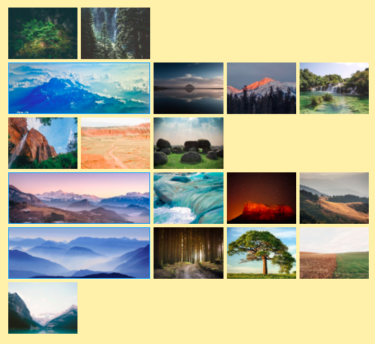
So lets try this instead
.horizontal {
    grid-column: auto / span 2;
}
auto will allow it to start wherever it naturally fits in and then just spans 2 columns from there.
But you can also just do this, for the same result.
.horizontal {
    grid-column: span 2;
}
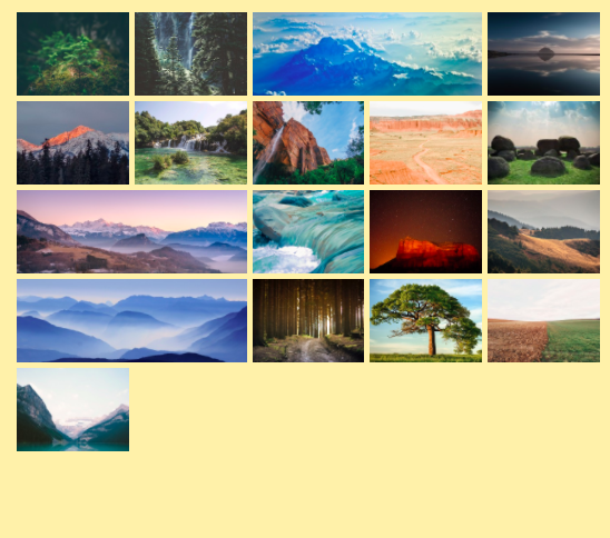
Cool! That looks much better.
Now we will change our .vertical.
.vertical {
    grid-row: span 2;
}
Which will look like this
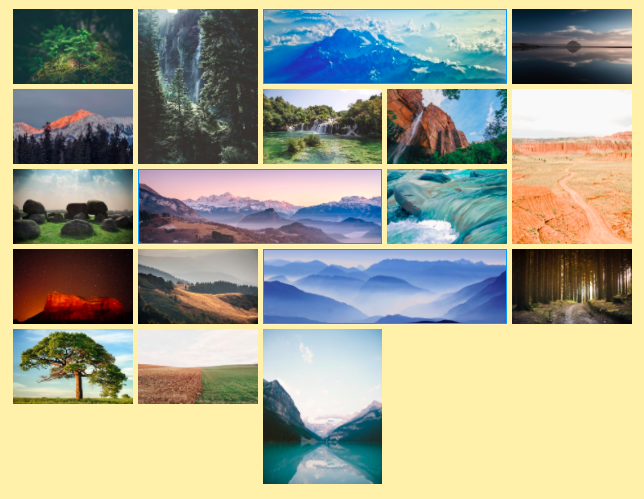
Awesome! Now our taller images are showing up and fitting in quite nicely.
Our .big images will be just a combo of the two.
.big {
    grid-column: span 2;
    grid-row: span 2;
}
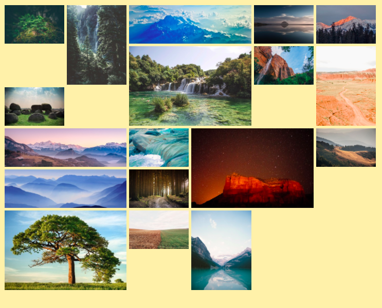
Ok, now our big images look great.
Our next problem is quite obvious however. What are we gonna do about all the empty cells???
Before we fix the problem, let's look at why they are there to begin with.
