Responsive Web Design and Media Queries

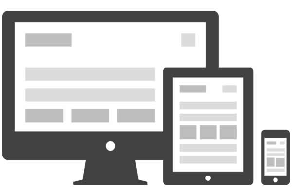
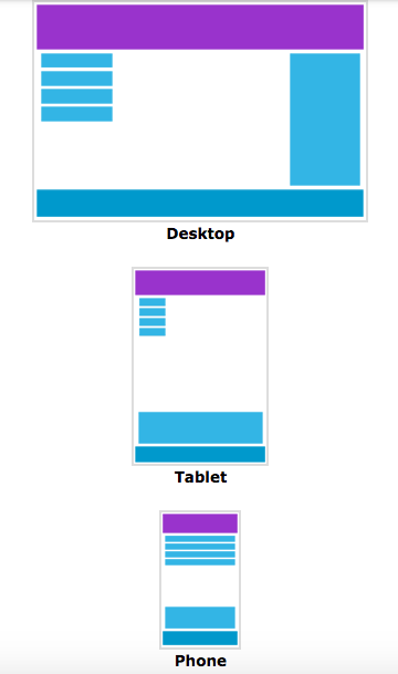
In this age of mobile devices the developer has to account for their product being viewed on a hand held or tablet sized device as well as laptops and desktops. This means your site should look great on any size screen!
Here is an example of a website that does not adapt to screen size. (Laptops and desktops: follow the link, grab a corner of your browser and shrink it to phone size...notice how none of the elements reposition and much of the information is offscreen because of it? This makes users very unhappy.)
Responsive web design
Responsive web design is an approach to web design aimed at making your sites content look great on all screen sizes.

These days, all web apps should be created with this approach.
Media queries
A media query is a fancy way of asking "How wide is the window." We can also query to check if our device is in landscape mode.
It's almost like writing an if statement for your CSS.
In our CSS, we could have the line:
@media (max-width: 500px){}
This is like saying, if the screen(or window of the browser) is less than 500px. We write the then part of the if-then statement in brackets.
@media (orientation: landscape) {
    .my-class {
        color: red;
    }
}
This one is saying: If the device in in landscape then turn .my-class red.
This example is arbitrary, but we could see how it would be nice to show certain wider content when in landscape, and hide it while our phone or tablet is in held upright.
These work with and statements as well...
@media (min-width: 600px) and (max-width: 800px) {
  html { background: red; }
}
So the screen must have a minimum width of 600 pixels AND a maximum width no greater than 800 pixels in order to run the code inside of the {}'s.
Media queries also work with or statements...
@media (max-width: 600px), (min-width: 800px) {
  html { background: red; }
}
Notice we use a "," rather than or, that is because the above statement will actually be read as two different media queries, but for the sake of understanding you can view this as a simple or statement.
So we might have several media queries to cover the many different size screens our site might be viewed on. We might have one for phone sized screens, one for tablets and one for laptops.
Here is sudo-code (not actual code, but an english approximation of the code) as an example:
if (phone size) do this {}
if (tablet size) do this {}
if (larger than tablet) do this {}
Let's now break down the two phrases you will see most often...max-width and min-width and how to remember which does what.
When using media queries we are checking to see if the screen size is between 0 and infinity but we will substitute min-width, if we have it, for the first number and max-width, if we have it, for the second number.
0 through infinity
        -or-
min-width through max-width
So, if we only have a min-width of 230px we are checking to see if our screen size is between min-width(230px) and infinity (we could say 10,000 if that helps).
230px through 10,000px
If our screen size was 650px width would the following media query would be true or false?
@media (min-width: 100px){...}
@media (min-width: 100px){...} // 650 -> true
Our screen size of 650px is between min-width (100) and infinity so the above code in {...} will run.
Here is another:
@media (max-width: 600px){...}
@media (max-width: 600px){...} //650 -> false
In the above we are checking to see if our screen size (650px) is between 0 and max-width... 0 - 600. 650 is not between them so the code in the {...} will not run.
@media (min-width: 601) and (max-width: 850px){...}
@media (min-width: 601) and (max-width: 850px){...} // 650px -> true
We are checking to see if our screen size (650px) is between min-width and max-width which translates to: 601 - 850. 650 is between those two numbers so the {...} will run.
Let's get a bit more complicated now.
If our screen size is 650px what color will our background be?
@media only screen and (min-width: 640px)  {background: blue}
@media only screen and (min-width: 479px)  {background: red}
You guessed it! Red!
Why? Because both media queries are true and so first the screen will be turned blue by the first query (too fast to see), then it will be turned red by the second. And red it will stay. (Unless acted upon later in our CSS!)
Suppose we wanted the first (background: blue) to apply to any screen size over 640?
@media only screen and (min-width: 640px)  {background: blue}
@media only screen and (min-width: 479px), (max-width: 639px) {background: red}
We added (max-width) to the second to give it a range. Thus the first will handle anything between min-width and infinity (10,000) so...640 - 10,000. And the second would be between min-width(479) and max-width (639) so...479 - 639.
479 - 639 --> red
640 - 10,000 --> blue
Note: I've used 10,000 as infinity to make it easier to read only. Infinity is, of course, not 10,000.
Note: only screen is made of two recognized key words, the first only is a keyword not recognized by older browsers and will keep this block of CSS from running on them. The second screen is saying if we are printing to a screen rather than email or printer, etc. then do the following code.
For more information on only see this Stack Overflow answer @Hybrid's answer.
Here is a link with the various sizes of common devices including Apple Watches, various phones, general rules for laptops/desktops (because there are so many) and tablets.
Let's look at some mobile first examples (because you should ALWAYS design for mobile first):
// This applies from 0px to 600px
body {
  background: red;
}
// This applies from 600px onwards
@media (min-width: 600px) {
  body {
    background: green;
  }
}
This accounts for only two sizes, but that is still better than accounting for only one, much better.
Here is a larger, or rather more detailed, example:
/*Mobile Large 620px*/
@media screen and (min-width: 38.75em) {
/*your code*/
}

/*Tablet Small 740px*/
@media screen and (min-width: 46.25em) {
/*your code*/
}

/*Tablet Large 880px */
@media screen and (min-width: 55em) {
/*your code*/
}

/*Desktop Small 955px*/
@media screen and (min-width: 59.6875em) {
/*your code*/
}

/*15.5 Desktop Medium 1100px */
@media screen and (min-width: 68.75em) {
/*your code*/
}

/*15.6 Desktop Large 1240px*/
@media screen and (min-width: 77.5em) {
/*your code*/
}

/*Desktop X-Large 1403px */
@media screen and (min-width: 87.6875em) {
/*your code*/
}

/*Print*/
@media print {
/*your code*/
}
Note: Bootstrap (the framework) uses media queries so while you will find that Bootstrap might be an easier choice to create responsive websites, you need to understand Media Queries to understand Bootstrap.
Mobile First
Mobile First is a popular design practice. This means that we design for phones and small screens first.
This helps our content load quicker on small screes.
Instead of using max as in @media only screen and (max-width: 750px) we use min.
@media only screen and (min-width: 750px)
Common usage
You will often see, and will more than likely what to encapsulate all the design for your media queries group in their sizes.
@media only screen and (min-width: 500px){
  p {
    font-size: 10px;
  }
  .nav-bar {
    display: none;
  }
}

@media only screen and (min-width: 750px){
  p {
    font-size: 15px;
  }
  .nav-bar {
    display: block;
  }
}
Media queries will overrule general CSS written outside of a media query block. So in both of the follow cases, the background color would be blue with the screen was less than 500px wide.
@media only screen and (max-width: 500px){
  body {
    background-color: blue;
  }
}

body {
  background-color: red;
}
body {
  background-color: red;
}

@media only screen and (max-width: 500px){
  body {
    background-color: blue;
  }
}

