Responsive color grid from scratch

Using CSS media queries, create a web page that looks like this:
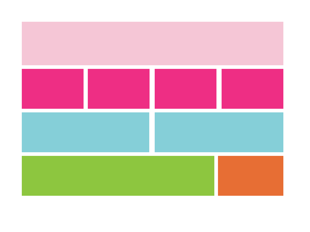
Here are the colors:
#F5C6D6#EE2E84#85CFD8#8DC63F#E76E34
To practice media queries, you must make this color grid keep it's regular form (look like the picture above) from large screens down until 768px. Once it gets below 768px, each color must expand to the full-width of its container, so it looks like this:
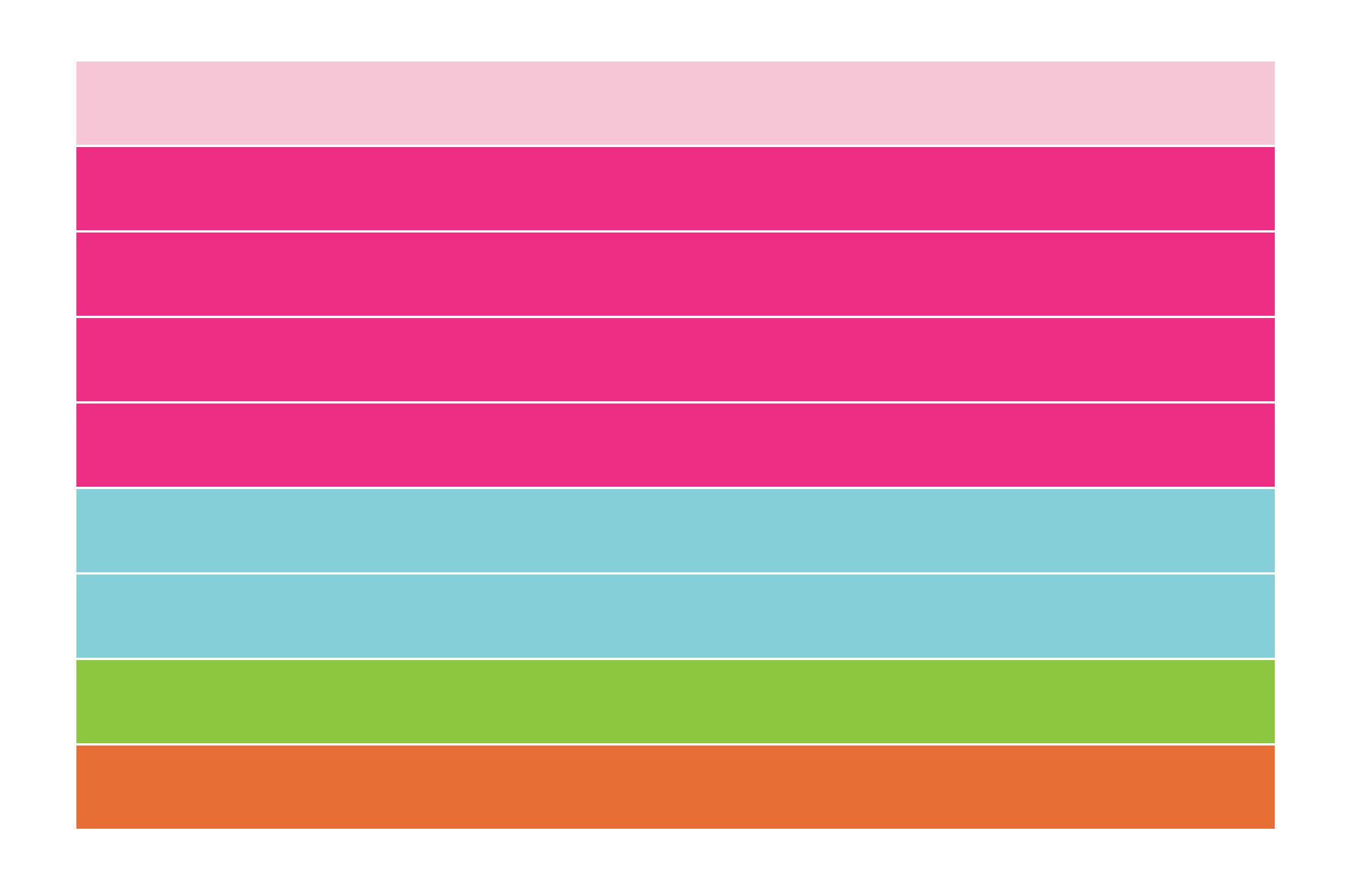
(This image is zoomed out so as to be able to show all the colors. Your boxes will remain the same height and space apart/same size white border as above.)
Hints:
- It's easiest to get the even white "spacing" by actually using a thick, white border around the shapes.
- In order to use percentage widths and not have them wrap, you'll need to add the following line to the top of your CSS:
* {
    box-sizing: border-box;
    font-size: 0px;
}