Flexbox Full Tutorial
This write-up is taken from the beautifully built course here: https://scrimba.com/g/gflexbox
Below are the 3 files used in this tutorial
index.html
<!DOCTYPE html>
<html lang="en">
<head>
    <meta charset="UTF-8">
    <title>Flexbox Intro</title>
    <link rel="stylesheet" href="style.css">
    <link rel="stylesheet" href="basic.css">
</head>
    <body>
        <nav class="container">
            <div>Home</div>
            <div>Search</div>
            <div>Logout</div>
        </nav>
    </body>
</html>
style.css
.container {
    border: 5px solid #ffcc5c;
}
basic.css
.container > div {
  padding: 10px;
  text-align: center;
  font-size: 2em;
  color: #ffeead;
}

html, body {
  background-color: #ffeead;
  margin: 10px;
}

.container > div:nth-child(1) {
  background-color: #96ceb4;
}

.container > div:nth-child(2) {
  background-color: #ff6f69;
}

.container > div:nth-child(3) {
  background-color: #88d8b0;
}
We will be working entirely in our style.css and index.html
Our starting page looks like this:
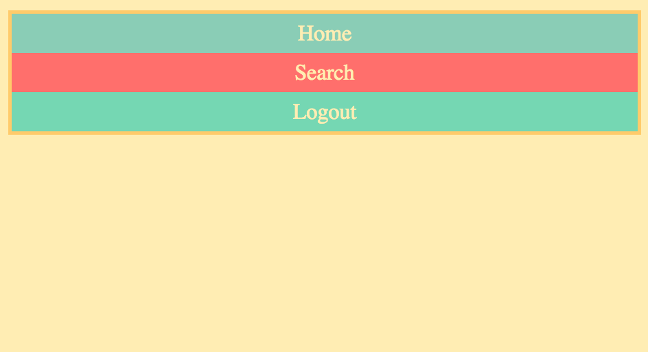
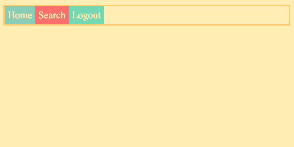
Let's add display:flex to our style.css
.container {
    display: flex;
    border: 5px solid #ffcc5c;
}
Notice this changes the default of our divs from stacking vertically to lining up horizontally.
Flexbox Axis
A flexbox container always has a direction. It is important to know that there are essentially two axis', given the default flex-direction: row, the main axis which is the content that spans from left to right, or horizontally, and the cross axis which is the content that spans from top to bottom, or vertically.
The css properties will be used to position our items along one of these two axis'.
flex-direction
Flex direction is how we swap what our axises are.
.container {
    border: 5px solid #ffcc5c;
    display: flex;
    flex-direction: <what goes here?>
}
One property you can use with flexbox is flex-direction. This has 4 possible choices:
row - The default. Main axis and cross axis act as explained above.

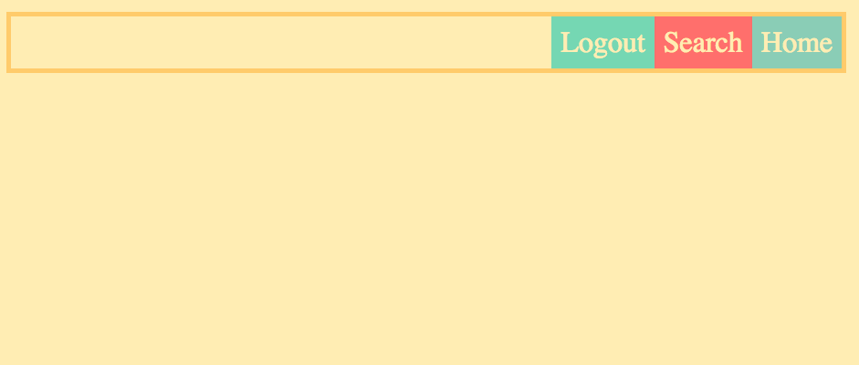
row-reverse - Reverses the direction of the main axis
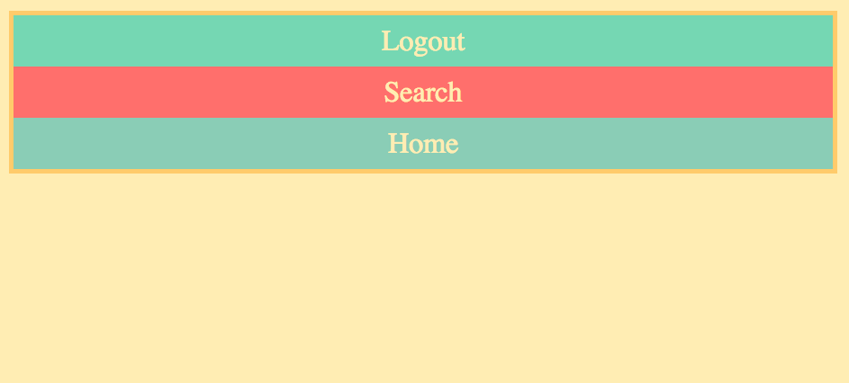
column - Causes the main axis to act vertically.

column-reverse - Same as column just with a reversed direction
justify-content
.container {
    border: 5px solid #ffcc5c;
    display: flex;
    justify-content: <what goes here?>
}
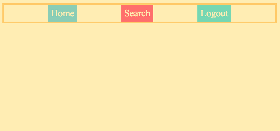
justify-content is used for positioning the elements along their axis'. 6 possible options are:
flex-start - The default. Positions the elements at the start of the main axis.

flex-end - Positions the elements at the end of the main axis.
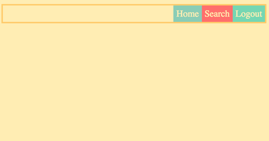
notice how this differs from row-reverse, it is simply pushing them to the end, not changing their order
center - Positions the elements in the center of the main axis.
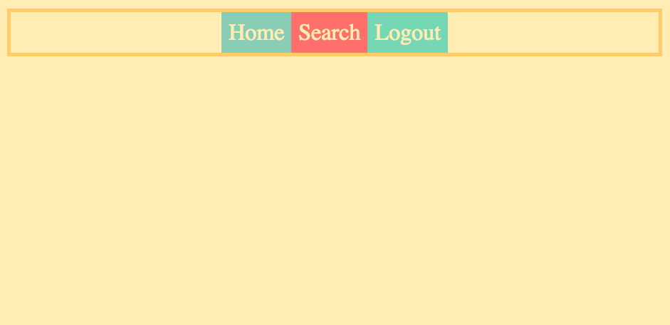
space-around - Positions the elements across the main axis with some space on both sides of each element.
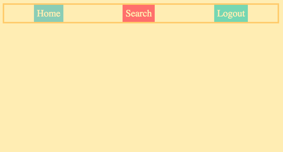
space-between - Similar to space-around but without the space on the outer margins.
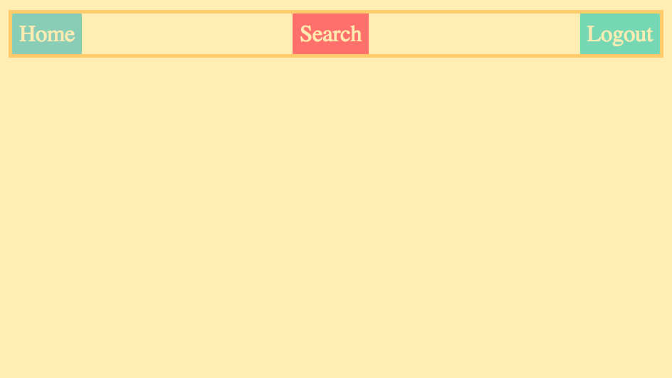
space-evenly - Similar to space-around but with perfectly even spacing both between and around each element.
Positioning Items Individually
The first thing we want to do when positioning items individually is to give each item it's own class.
index.html
<div class="container">
            <div class="home">Home</div>
            <div class="search">Search</div>
            <div class="logout">Logout</div>
        </div>
Next, go into our style.css and select one.
style.css
.container {
  border: 5px solid #ffcc5c;
  display: flex;
}

.logout {
  margin-left: auto;
}
Which will result in something like this
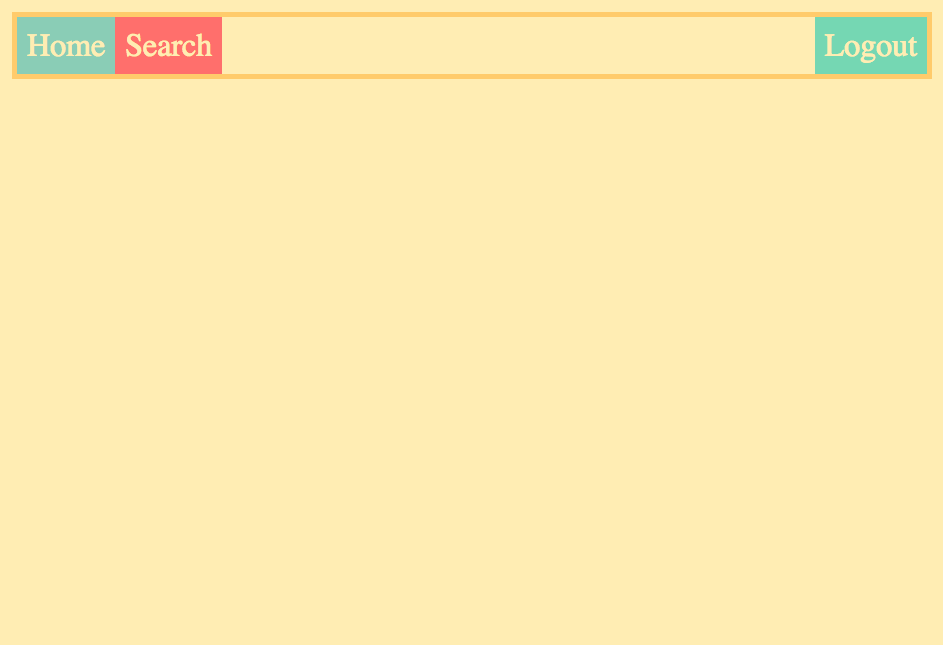
or you can grab a couple by targeting the neighboring elements class name
.search {
  margin-left: auto;
}

Cool, right? If we had 10 elements it would work in the same way, whichever class is targeted, all of the following classes would be grouped with it.
You can target it from the opposite side using the following code.
.container {
  border: 5px solid #ffcc5c;
  display: flex;
  *justify-content: flex-end;*
}

.home {
  margin-right: auto;
}
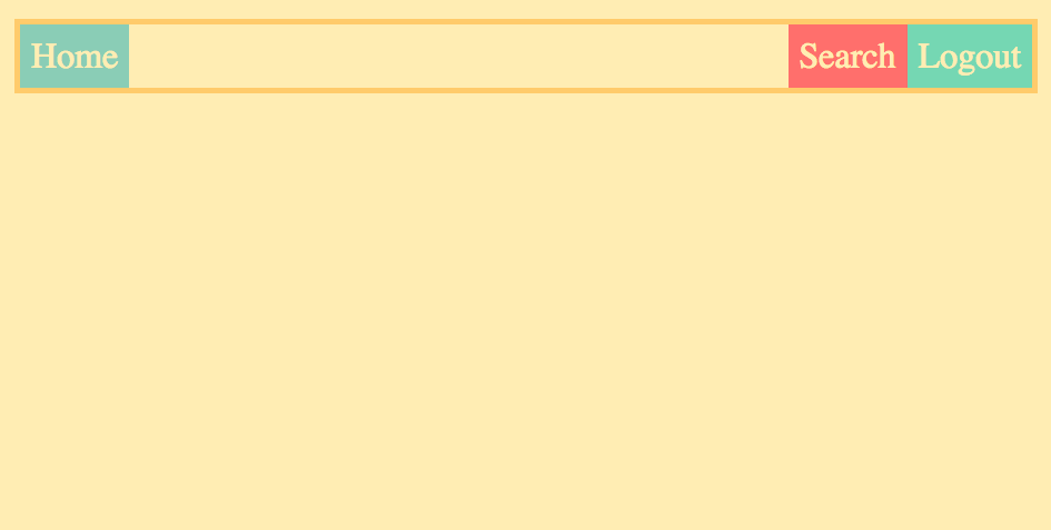
It looks the same, however it is pulling it from the right side rather than the left.
Responsiveness & The Flex Property
If we want our elements to fill the empty space and become responsive, we will use the flex property.
.container {
  border: 5px solid #ffcc5c;
  display: flex;
}

.container > div {
  flex: 1;
}
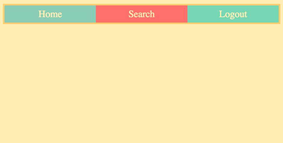
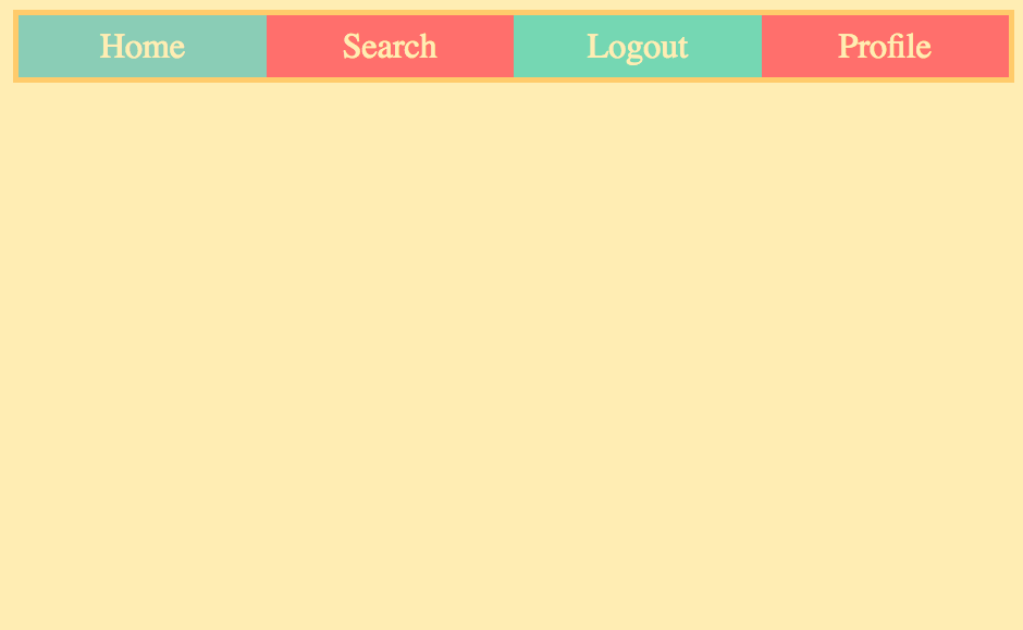
What is happening is each div element is being divided evenly with 1 section or fraction of the row.
It is important to note that flex in this instance is a shorthand of flex-grow, flex-shrink, and flex-basis but we will talk about those later.
If we add more elements, it will continue to distribute them evenly across the row.
<div class="container">
            <div class="home">Home</div>
            <div class="search">Search</div>
            <div class="logout">Logout</div>
            <div class="profile">Profile</div>
        </div>
If you want to give a little more space to a specific element you can do so by targeting it like this:
.container {
  border: 5px solid #ffcc5c;
  display: flex;
}

.container > div {
  flex: 1;
}

.container > .search {
  flex: 2;
}
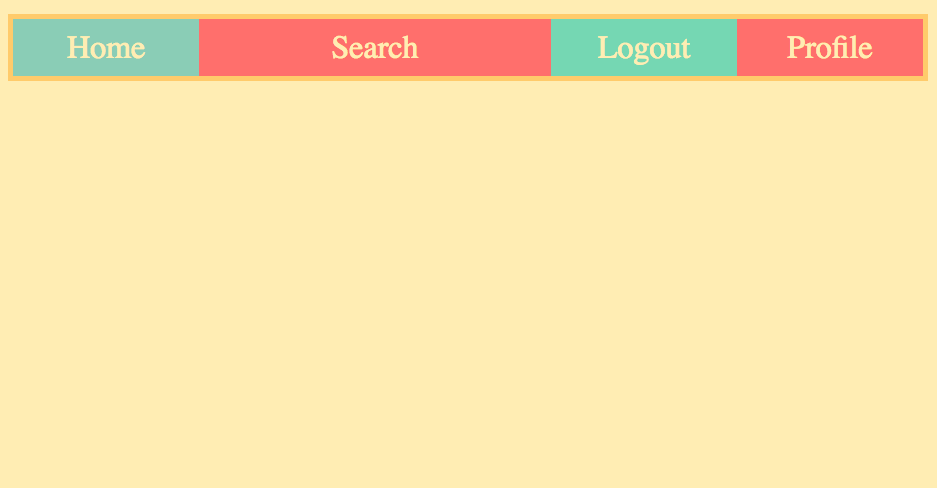
Now our search element has 2 fractions/sections of the row while the rest each only get 1.
If you try to just select .search rather than .container > .search it will not work because the .search is less specific than the .container > .div so it will get overridden by that code. So be sure to select in in this way, using the .container > .search format.
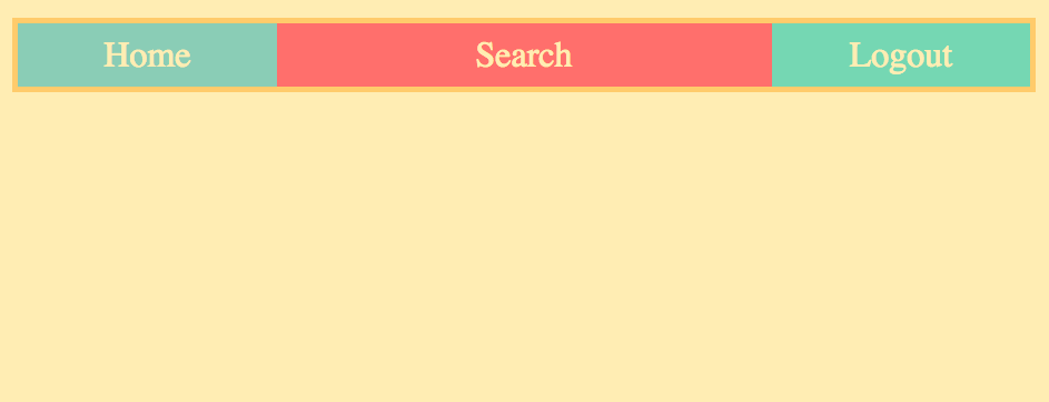
A more realistic and efficient way of doing this is to target just one item, like so:
.container {
  border: 5px solid #ffcc5c;
  display: flex;
}

.search {
  flex: 2;
}
This has the same effect but by specifying the width of one element, it defaults the rest to one fraction size each.
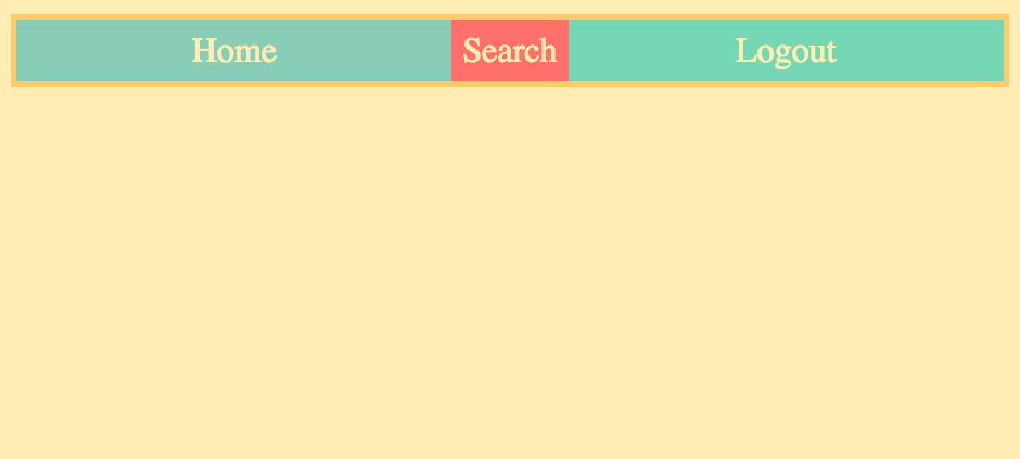
or you can do the inverse:
.container {
  border: 5px solid #ffcc5c;
  display: flex;
}

.home {
  flex: 1;
}

.logout {
  flex: 1;
}
The Cross Axis
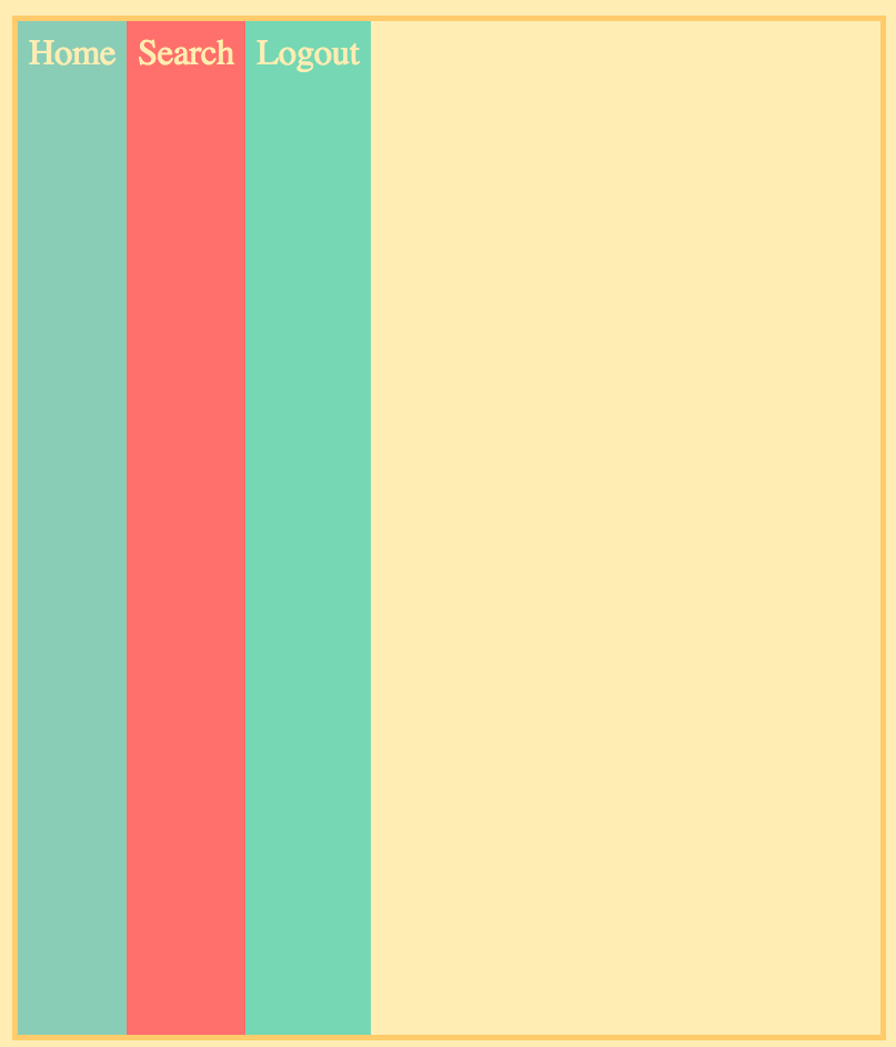
The cross axis controls the elements from top to bottom. This includes even just one row of elements. For example, if I added a height 100% to our .container then it would make our row span the height of the page.
However, you would also have to add a height 100% to the html,body because otherwise it only makes it fit into just the height of the container which defaults to the content within it. So by setting it to html and body it assures that it will be referring to the full size of the page and will look like this:

align-items
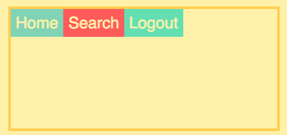
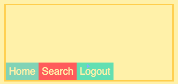
One main tool for controlling elements along the cross axis is align-items. There are 4 main options you can use with this:
stretch - The default, stretches the elements to fill the whole height of the page.
flex-start - This pushes the elements to the top/start of the cross axis.
flex-end - This pushes the elements to the bottom/end of the cross axis.
center - This pushes the elements to the middle/center of the cross axis.
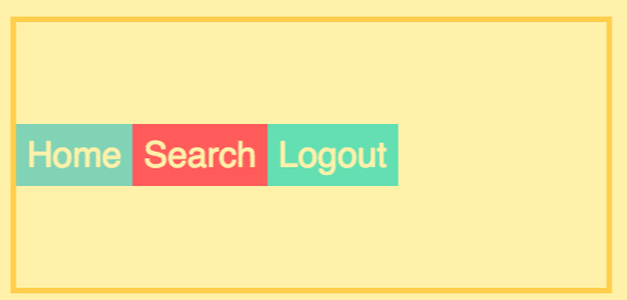
side-note (if you want to center an item in the middle of a container, use both align-items: center; and justify-content:center;)
align-self
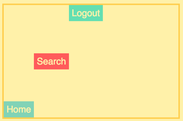
To control the items individually you can use align-self, below is an example:
.container {
  border: 5px solid #ffcc5c;
  display: flex;
  height: 100%;
  align-items: center;
}

.logout {
  align-self: flex-start;
}

.home {
  align-self: flex-end;
}
which would look like this
flex-direction w/ align-items && justify-content
Using the flex-direction: column basically switches the roles of align-items and justify-content
column - This changes the direction of the row to act like a column, or in other words it switches the main-axis to the cross-axis.

if you apply a height:100%; to the .container, html, body then you can control the items with justify-content in the same ways that you would use align-items.
for example
.container {
  border: 5px solid #ffcc5c;
  display: flex;
  flex-direction: column;
  justify-content: center;
  height: 100%;
}
Would look like this
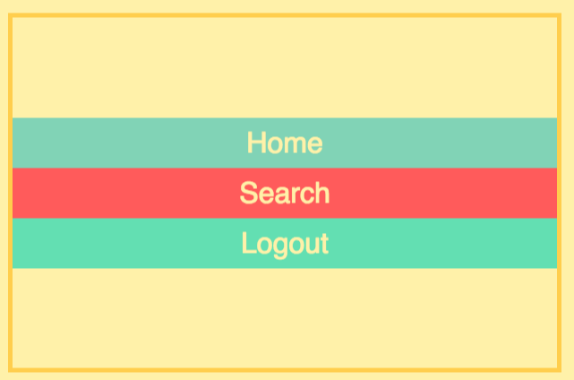
align-items will also now act as if it were justify-content.
flex-wrap
First, let's try and set a specific width to each of our items
.container {
  border: 5px solid #ffcc5c;
  display: flex;
}

.container > div {
  width: 300px;
}
Now if our window only has a width of less than 900px then it will just scale down each element to have an equal portion.

But if we make the window larger than 900px then it will do this

That is because it is set to the default of nowrap. Let's take a look at the other options available to us from flex-wrap.
nowrap - The default. Makes it so you can only have one row, or one column along your given main axis.
wrap - This causes the items to wrap when there is no longer space for their given width.

flex-grow, flex-shrink, flex-basis
These are all part of the flex property.
Let's start with this code.
.container {
  border: 5px solid #ffcc5c;
  display: flex;
}

.home {
  flex: 1;
}

.logout {
  flex: 1;
}
This looks like:

Now in reality, what this actually would look like is this:
.container {
  border: 5px solid #ffcc5c;
  display: flex;
}

.home {
  flex: 1 1 0;

  or

  flex-grow: 1;
  flex-shrink: 1;
  flex-basis: 0;

}

.logout {
  flex: 1 1 0;

  or

  flex-grow: 1;
  flex-shrink: 1;
  flex-basis: 0;

}
flex-basis - This will set the base width of each element.
flex-grow - This will determine how much of the extra space will be distributed to the items. So flex-grow: 0 would not use any of the space. If you did flex-grow:1 it would absorb all the space. But the flex-grow properties are also relational to the other elements in the container. So consider the following example
.container {
  border: 5px solid #ffcc5c;
  display: flex;
}

.home {
  flex-grow: 1;
  flex-basis: 200px;
}

.logout {
  flex-grow: 2;
  flex-basis: 200px;
}
This would look cause the logout to absorb twice as much empty space as the home.

flex-shrink - This is basically the inverse of the flex-grow property. So it determines how much the elements will shrink once the page is smaller than their combined width or basis. Consider the below example
.container {
  border: 5px solid #ffcc5c;
  display: flex;
}

.home {
  flex-shrink: 0;
  flex-basis: 200px;
}

.logout {
  flex-shrink: 1;
  flex-basis: 200px;
}
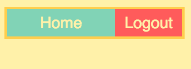
Notice that the .home does not shrink but the .logout does
To summarize the flex property.
This code
.container {
  border: 5px solid #ffcc5c;
  display: flex;
}

.home {
  flex-grow:1;
  flex-shrink:1;
  flex-basis: 200px;
}

.logout {
  flex-grow:1;
  flex-shrink:1;
  flex-basis: 200px;
}
is the same as this code
.container {
  border: 5px solid #ffcc5c;
  display: flex;
}

.home {
  flex: 1 1 200px;
}

.logout {
  flex: 1 1 200px;
}
Order
I will be using this html
<body>
        <div class="container">
            <div class="item1">1 Home</div>
            <div class="item2">2 Search</div>
            <div class="item3">3 Logout</div>
        </div>
    </body>

Now in our CSS we can use the order property:
.item2 {
  order: 1;
}
which will move our .search to the 3rd spot.

By default, html is ordered at 0 for each element. So when we change the order to 1, it puts it at the end. If we made it order: -1 then it would put that element at the beginning.
So you can order as many items as you want by changing the order based on the order of each element, for example:
.item1 {
  order: 1;
}

.item2 {
  order: 0;
}

.item3 {
  order: -1;
}
This would put them in reverse order

And that's it!

