CSS Zen Garden

The purpose of this assignment is to do what you can with what you know (eyeball and guestimate). If there is something new, you are welcome to learn/google it, but is not required to pass the assignment. You can ignore details such as the fixed backgrounds, which use the background-attachment property.
Some students choose to mimic the sight completely. This is awesome practice and if completed well can be a great portfolio piece to display side by side with the original site.
Assignment
One of the most common tasks for front-end web developers and web designers is to receive a "PSD" (Photoshop Document) that contains the design of a desired website and to have to translate what you see in the PSD to the web.
One excellent way to practice for this task is to find a website you like the look and feel of, and mimic it.
Project Requirements
Open the website http://www.csszengarden.com/
Your task is to replicate this site without simply copying the source code. It will be more difficult to approach it that way, as their approach is complicated.
Part of replicating the site will require you to make it responsive. Change the width of your browser to see what the original site would look like on a mobile device, and try to mimic it in your own version of the site.
You are permitted to pull things from the original site like the logos and other photos, and you're also allowed to inspect the code to get insight into some of the styling aspects of the original site, such as the font family and colors being used. Do not inspect the code of the original site to learn how you should lay out your HTML, position things with CSS, etc. As a rule of thumb, you're not allowed to copy aspects found in the site's original code that you wouldn't be given by a designer in a PSD. (In Photoshop, you can get the font family of text, the hex codes for the colors used, and the logos and photos being used, but receive no insight into writing the HTML or positions/sizing with CSS).
Passing Criteria: Visual inspection by an instructor or TA and a short interview.
An instructor will check the site for general similarity to the original web site, as well as have a quick discussion about what the hardest parts of this assignment were and what was most helpful in the process.
Layout and responsiveness are the biggest things the instructors will be looking for. Other than that, go for the low hanging fruit to make it look similar to the original site like color, fonts, spacing, and other aspects that are relatively easy to achieve that make it look close.
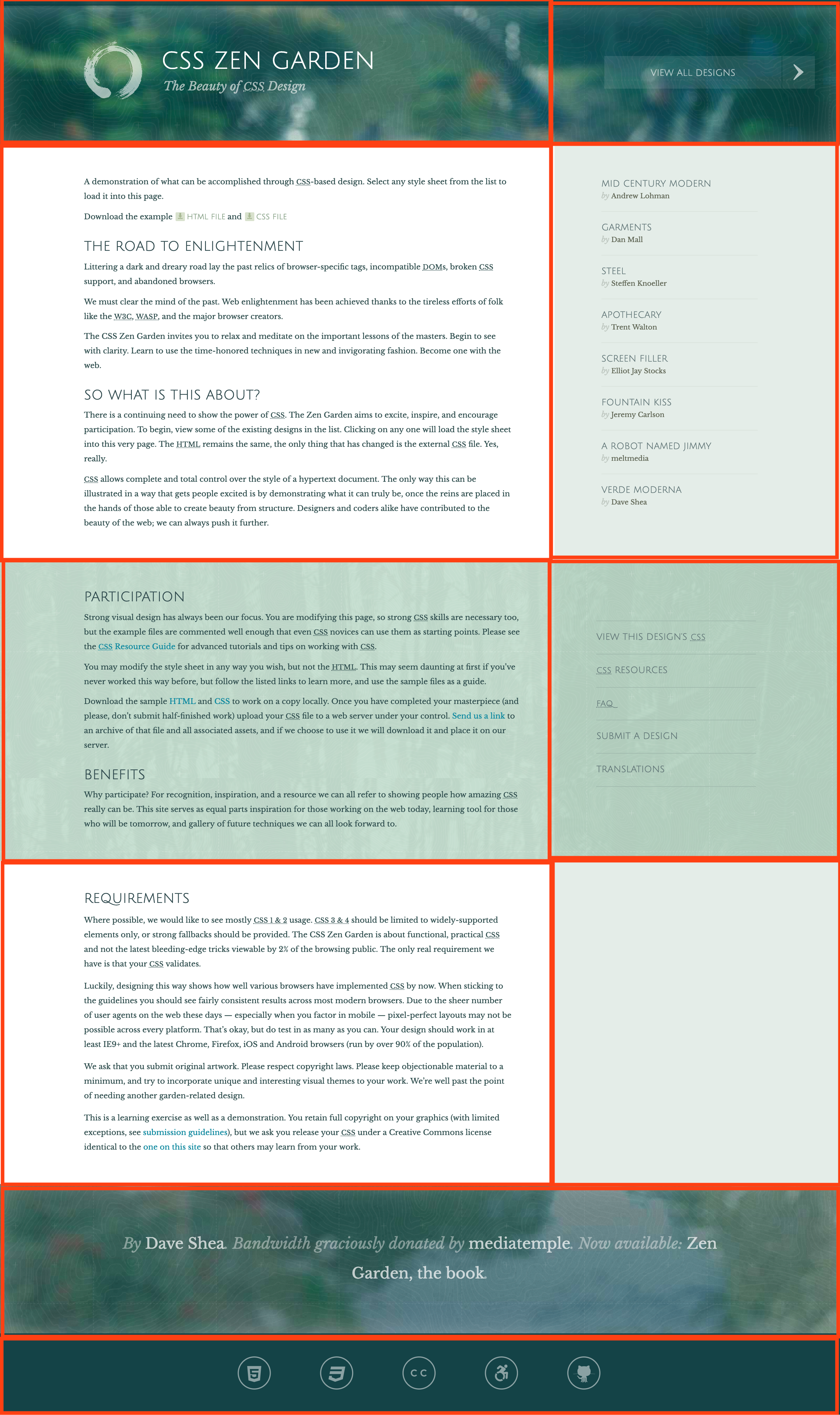
The instructor will want to see the authors panel and the menu links drop below the footer when the window width is narrow.
HINTS and Help
- Links and JavaScript functionality do not have to work.
- Fonts, images, etc can be found in the sources tab.
- Write your HTML and CSS from scratch. Do not copy and paste from Chrome dev tools.
- This project is expected to take a lot of time. It's difficult. Please don't get stuck on any one aspect for too long. Ask your class mates how they approached different problems.
- USE YOUR DEV TOOLS. Switching from chrome to your editor will WASTE TIME.
- The social media icons at the bottom of the page are actually a font, not images. Check the sources tab to find the font and feel free to download it from there
LAYOUT HINT
In my personal opinion (Eric Jones) 10 main divs should be used. One for each section of the page. display: grid can be used on their parent.

This is for responsive design. If you watch how the layout changes when your screen size shrinks down, you'll see how they pieces are detached.
A mix of CSS Grid and media queries is the best grid system for this site in my opinion. It's going to be better for setting up the layout of the whole site than flexbox, Bootstrap's grid system, and for sure better than the old CSS positioning, or using HTML Tables. Flexbox is good for the social icons in this assignment. Feel free to use it inside any of the panels.

