CSS Transitions

CSS Transitions are an excellent way to add some smoothing effects to your web page. While it's nice that we can change styles based on an element's state (with the pseudo selectors :hover, :active, etc.), it can sometimes be a bit jarring when the effect happens immediately upon hovering, or clicking, etc.
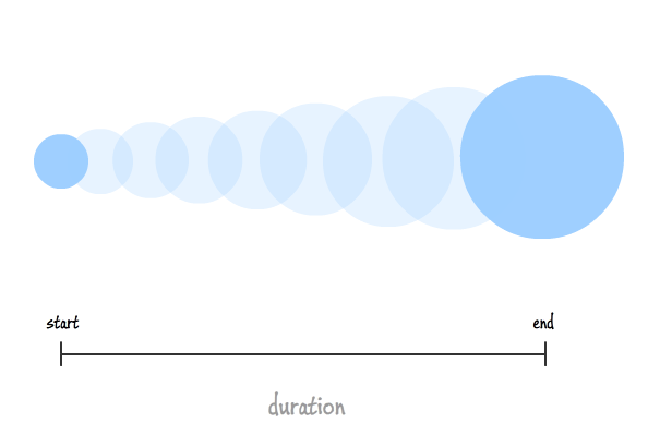
Enter CSS Transitions. Transitions allow us to slow down the time it takes to transition from one style to another. We can specify how long the transition should take, which properties should be affected by the slower transition, and what kind of transition timing style it should take.
Example
We'll just be working with a simple box in our HTML:
<div class="box"></div>
And add some basic styling to the box and change a few things when we're hovering on the box:
.box {
    width: 300px;
    height: 300px;
    background-color: aquamarine;
    margin: auto;
    border: 1px solid #333;
    box-shadow: 10px 10px 5px 0 #999;
    border-radius: 10%;
}

.box:hover {
    box-shadow: none;
    border-radius: 0;
    background-color: cyan;
}
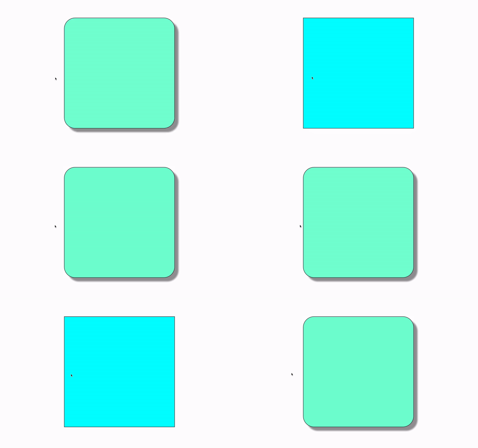
With this box, the :hover state is triggered the instant the mouse hovers on the box, and instantaneously applies the new hover styles:

But we want the transition from the regular state to the hover state to be a bit more fluid and smooth. Time for transitions!
Transition options
CSS 3 gives us a number of properties that help us create transition effects between an element's state. The four transition properties are:
transition-propertytransition-durationtransition-timing-functiontransition-delay
transition-property
The CSS property called transition-property allows us to pick and choose which of the CSS properties we want to transition smoothly. In the above example, we could decide to transition the background shadow to disappear slowly over perhaps 2 seconds, but make the color change immediately upon hovering.
With transition-property, we simply write the name of each CSS property we want to transition with commas in between each name:
.box {
    ...
    transition-property: box-shadow, border-radius, background-color;
}
However, in this instance we're simply re-writing all of the properties we added on our :hover class. For these instances, CSS provides the transition-property: all option.
If you're following along, you may notice that nothing seems to have changed! That's because we also need, by necessity, to include the transition-duration property, otherwise it will still transition instantly.
transition-duration
This property simply tells the transition how long it should take to complete. This is what makes the magic work:
.box {
    ...
    transition-property: all;
    transition-duration: 1s;
}
Now we have a working transition! There are a few other options given to us that are worth mentioning before finishing up
transition-timing-function
The transition-timing-function is a way to change the style of the transition from one state to the next. They're all pretty similar and mostly exist to add a small touch of design to the animated transitions. The best way to see the difference between all the options is to check out this site's example
We'll add transition-timing-function: ease-in-out to our CSS:
.box {
    ...
    transition-property: all;
    transition-duration: 1s;
    transition-timing-function: ease-in-out;
}
On to the last transition property
transition-delay
This one simply tells the CSS how long to wait before even beginning the transition. This one is pretty straightforward, as you would simply add transition-delay: 0.1s to your CSS if you wanted it to wait for a tenth of a second before ever executing the transition.
If you're going to use this property, we'd recommend keeping the delay pretty short. Otherwise it can make your site seem slower than it really is.
Shortcut transition property
Like many other properties in CSS, there is a shortcut that allows us to define the transition-property, transition-duration, transition-timing-function, and transition-delay properties all together. It's called simply transition, and goes in this order:
transition: [transition-property] [transition-duration] [transition-timing-function] [transition-delay];
The square brackets [] simply indicate that they are all optional; you don't actually type in square brackets. It is very common to see something like the following in a site's CSS:
transition: all 0.5s ease-in-out;
That's a TON easier than writing out each one individually! You can still put your separate transition-propertys in there instead of all and it will still work.
Cross-browser compatibility
CSS transition properties are still not used the exact same between different browsers. For this, there are the typical "vendor prefixes" that you should use when you decide to use a transition in your CSS:
-webkit-transition: all 1s ease-in-out;
-moz-transition: all 0.5s ease-in-out;
-o-transition: all 0.5s ease-in-out;
transition: all 0.5s ease-in-out;
Conclusion
Here's the final code:
.box {
    width: 300px;
    height: 300px;
    background-color: aquamarine;
    margin: auto;
    border: 1px solid #333;
    box-shadow: 10px 10px 5px 0 #999;
    border-radius: 10%;
    -webkit-transition: all 1s ease-in-out;
    -moz-transition: all 0.5s ease-in-out;
    -o-transition: all 0.5s ease-in-out;
    transition: all 0.5s ease-in-out;
}
.box:hover {
    box-shadow: none;
    border-radius: 0;
    background-color: cyan;
}
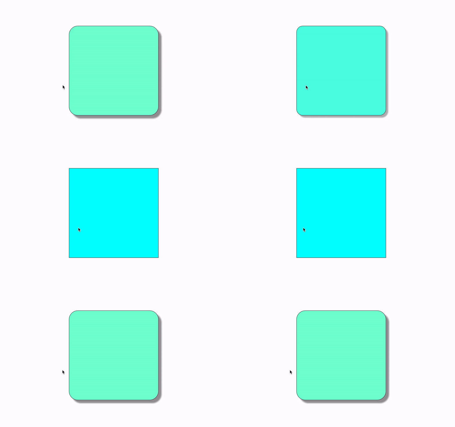
And the final result:

