CSS Grid
This write-up is taken from the beautifully built course here: https://scrimba.com/g/gR8PTE
This will give you a brief rundown of the main functionality presented with CSS Grid and hopefully a simple explanation of how to implement it yourself.
If you want the cool color scheme below add this to your css.
.container > div {
    display: flex;
    justify-content: center;
    align-items: center;
    font-size: 2em;
    color: #ffeead;
}

html, body {
  background-color: #ffeead;
  margin: 10px;
}

.container > div:nth-child(1n) {
  background-color: #96ceb4;
}

.container > div:nth-child(3n) {
  background-color: #88d8b0;
}

.container > div:nth-child(2n) {
      background-color: #ff6f69;
}

.container > div:nth-child(4n) {
      background-color: #ffcc5c;
}
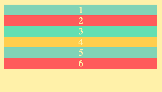
First, lets make a simple html page that looks like this.
<html>
    <head>
        <link rel="stylesheet" href="index.css">
        <style>
            .container {
                display: grid;
            }
        </style>
    </head>
    <body>
        <div class="container">
            <div>1</div>
            <div>2</div>
            <div>3</div>
            <div>4</div>
            <div>5</div>
            <div>6</div>
        </div>
    </body>
</html>
Adding display: grid will allow us to use all of the properties pertaining to CSS Grid.
Feel free to style your div's however you want, it doesn't have to look like mine.
But you should end up seeing something similar to this.
Grid-template-columns
Now lets see what ways we can alter the different divs as columns.
First we will look at using px.
.container {
                display: grid;
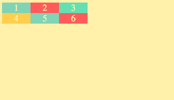
                grid-template-columns: 100px 100px 100px;
            }
Which tells our HTML page that we only want 3 columns and that we want each of them to only be 100px wide.
.container {
                display: grid;
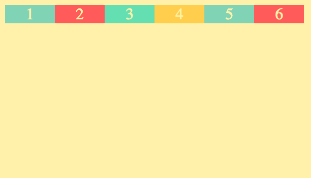
                grid-template-columns: 100px 100px 100px 100px 100px 100px;
            }
If you add 6, it will make 6 columns with a width of 100px.
If you want it to be responsive you can use auto instead of a px length.
.container {
                display: grid;
                grid-template-columns: 100px auto 100px;
            }
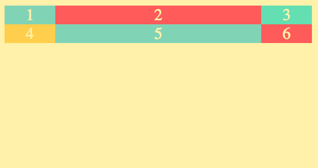
Feel free to make your window bigger and smaller and watch how the column labeled as auto expands/shrinks to fill the page.
A more common alternative to auto is fr. fr stands for fraction. You can specify how many fractions of the window you want each column to take up by simply putting the number in front of fr. So if i want the left and right edges to take up 1fr and i want the middle to take up 2fr. The code would look like this.
 .container {
                display: grid;
                grid-template-columns: 1fr 2fr 1fr;
            }
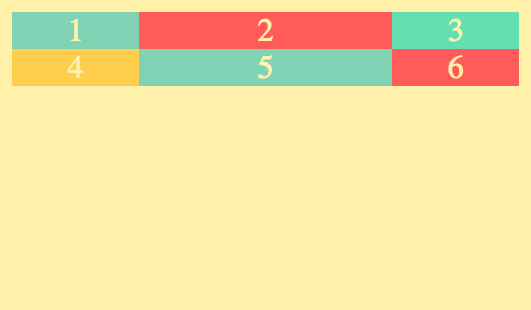
You can go as high as you want, but will usually want to use the smallest fraction available. For example if I did the following code instead, it would produce the same result, but would introduce potentially undesirable problems later on.
DON'T DO THIS
.container {
                display: grid;
                grid-template-columns: 100fr 200fr 100fr;
            }
But the point is that the proportion is what matters, not necessarily the fraction amount.
if you are wanting all your columns to be the same width, you can write grid-template-columns: 1fr 1fr 1fr; or you can use repeat().
repeat()
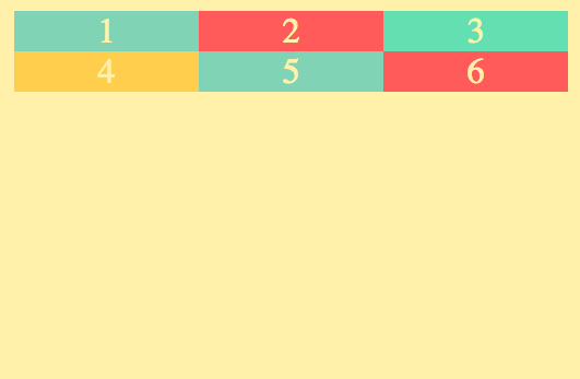
repeat() takes two parameters, the first is the number of columns and the second is the column width.
.container {
                display: grid;
                grid-template-columns: repeat(3, 1fr);
            }
and
.container {
                display: grid;
                grid-template-columns: repeat(3, auto);
            }
would both produce the same result
.container {
                display: grid;
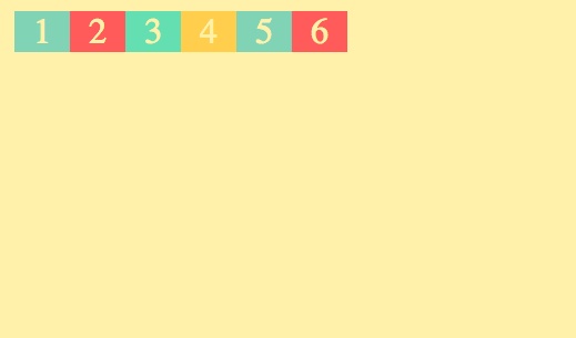
                grid-template-columns: repeat(6, 50px);
            }
would look like this
Remember that repeat() is only useful for when you are wanting all the columns to be the same size.
grid-template-rows
grid-template-rows is the same as grid-template-columns but with rows instead.
So while with grid-template-columns you are setting/adjusting the width. With grid-template-rows you are setting/adjusting the height.
One difference to note is that fr cannot be used with grid-template-rows.
.container {
                display: grid;
                grid-template-columns: repeat(3, 1fr);
                grid-template-rows: 100px 100px;
            }
This will make 2 rows each with a height of 100px;
.container {
                display: grid;
                grid-template-columns: repeat(3, 1fr);
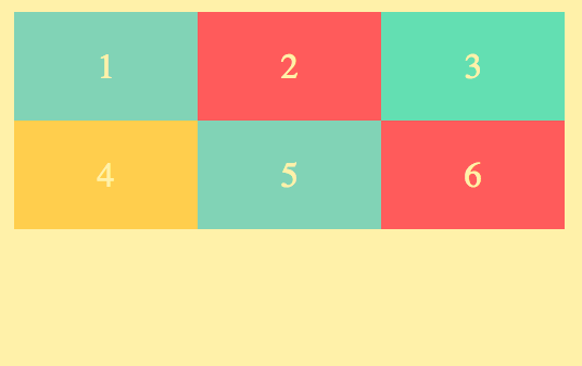
                grid-template-rows: 50px 100px;
            }
would look like this.
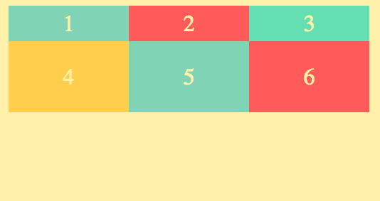
Notice how the first row on this one is 50px high and the second is 100px;
You can add more rows by adding more px amounts.
if you don't add more px amounts for the amount of rows present, it will default to the height of the content inside of it.
.container {
                display: grid;
                grid-template-columns: repeat(2, 1fr);
                grid-template-rows: 100px;
            }
So this would make 2 columns, but since we have 6 divs, the extra divs will run over and create 3 rows total. But we only specified the height of 1 row, so it would look like this
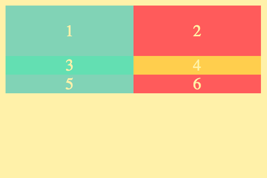
You can also use repeat() in the same way, just without using fr or auto. You have to use px.
grid-gap
grid-gap adds some space in between each of the divs to make it look a little nicer.
.container {
                display: grid;
                grid-template-columns: repeat(3, 1fr);
                grid-template-rows: repeat(2, 100px);
                grid-gap: 5px;
            }
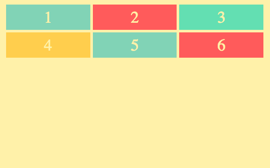
notice the space between each box.
grid-template
grid-template will provide a condensed version of what we did with grid-template-rows and grid-template-columns.
grid-template takes two values.
.container {
                display: grid;
                grid-template: (grid-template-rows) / (grid-template-columns)
                grid-gap: 5px;
            }
The following code snippets would produce the same result
.container {
                display: grid;
                grid-template-columns: repeat(3, 1fr);
                grid-template-rows: repeat(2, 100px);
                grid-gap: 5px;
            }
.container {
                display: grid;
                grid-template: repeat(2, 50px) / repeat(3, 1fr);
                grid-gap: 5px;
            }

POSITIONING
Add the following code to your css.
.container {
    display: grid;
    grid-gap: 3px;
    grid-template-columns: repeat(2, 1fr);
    grid-template-rows: 40px 200px 40px;
}

.header {}

.menu {}

.content {}

.footer {}
change your HTML to look like this
<html>
    <head>
        <link rel="stylesheet" href="index.css">
        <link rel="stylesheet" href="style.css">
    </head>
    <body>
        <div class="container">
            <div class="header">HEADER</div>
            <div class="menu">MENU</div>
            <div class="content">CONTENT</div>
            <div class="footer">FOOTER</div>
        </div>
    </body>
</html>
grid-column-start, grid-column-end & grid-column
Currently our page should look like this
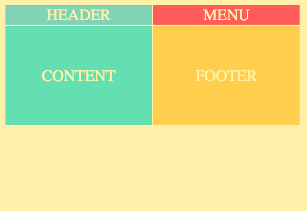
now lets add this code to our .header in our css
.header {
     grid-column-start:1;
     grid-column-end: 3;
}
It will now look like this
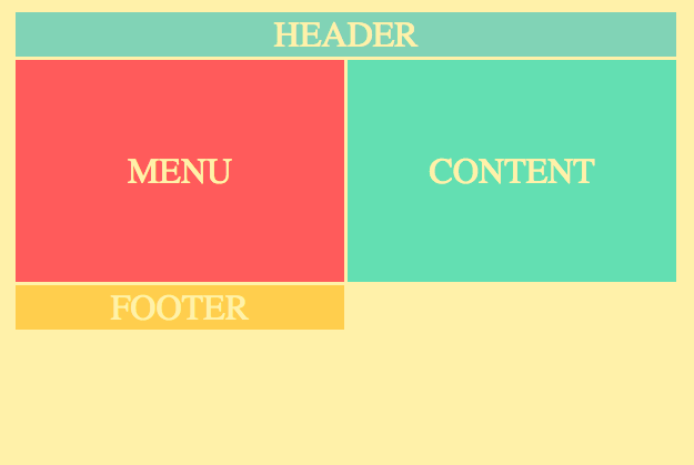
Cool! Now our header spans the whole length of the window.
Take note that this pushed our footer into a third row. You may be wondering why we set grid-column-end to 3 when we only have 2 columns. grid-column-end goes to the start of the column indicated but does not include it. So it starts at column 1 and goes to the start of column 3(or the end of column 2).
For the exact same result in less code. You can use grid-column instead.
.header {
     grid-column: 1/3;
}
So to be clear, grid-column works like this.
grid-column: (grid-column-start)/(grid-column-end)
Another alternative is using span like this.
.footer {
    grid-column: 1 / span 2;
}
This acts in the same way as shown by the result in our window.
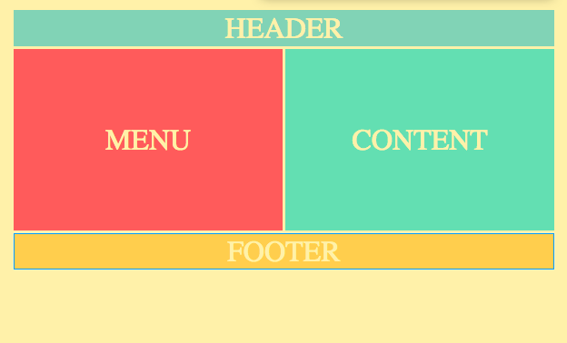
The difference between grid-column: 1/3; and grid-column: 1 / span 2; is that the former is specifying where specifically it is going to cover, whereas the latter indicates how a starting point and then how many columns it will span rather than just two specific locations.
One more alternative is
.footer {
    grid-column: 1 / -1;
}
Again this will produce the same result. The -1 will target the very last column line.
This last method is the best route to take if you are wanting to span the whole page because you may not always know exactly how many columns there are and this will always span the full page width.
Now lets fix the menu and content, we don't want them to share equal portions of the page. We can't use grid-column like we have been to fix it because we there are only 2 columns so we cant make the content column cover more of the page unless we make changes in our grid-template.
One possible option would be to do something like this
.container {
    display: grid;
    grid-gap: 3px;

    **grid-template-columns: 1fr 4fr;**

    grid-template-rows: 40px 200px 40px;
}
That would look like this
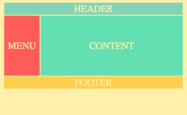
Seems nice right?
WRONG!
Just kidding, it does seem nice. The problem comes when we want to add more stuff in our content section and organize that. Because with our current layout we still only have 2 columns.
A better solution would be something like this.
.container {
    display: grid;
    grid-gap: 3px;

    **grid-template-columns: repeat(12, 1fr);**

    grid-template-rows: 40px 200px 40px;
}
and then
.content {
    grid-column: 2/-1;
}
The result
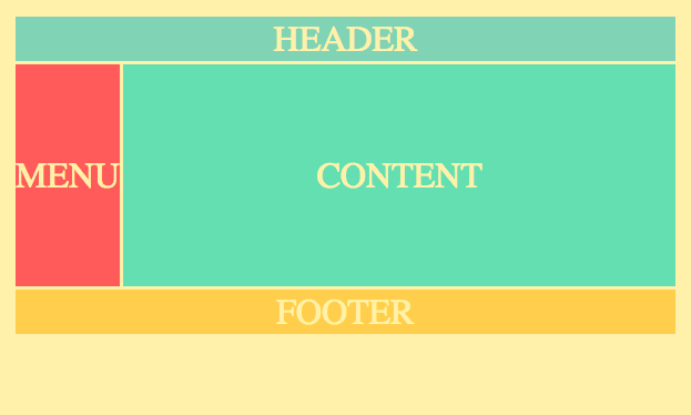
Here is a look at it with the grid showing
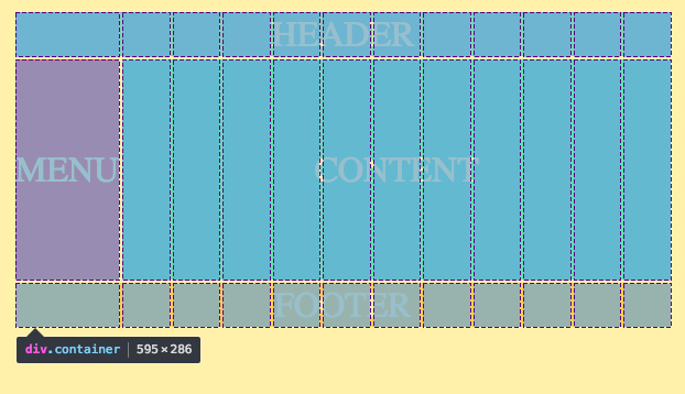
Much better! Now we have so much more flexibility with our content section.
grid-row
We still have another problem. The menu sometimes goes to the very top of the page. If we want to do that, we will just do the following code.
.header {
    grid-column: 2/-1;
}
This will leave some space up top by the header
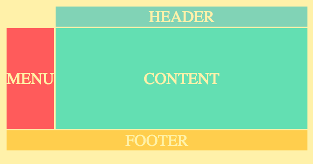
Now we simply add
.menu {
    grid-row: 1/3:
}
and we get...
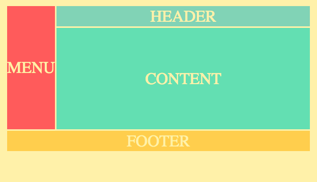
grid-row works in the same way as grid-column but rather than left to right, it is top to bottom.
grid-template-areas
Take note of the small changes I made in our CSS
.container {
    height: 100%;
    display: grid;
    grid-gap: 3px;
    grid-template-columns: repeat(12, 1fr);
    grid-template-rows: 40px auto 40px;
}

.header {
    grid-column: 1 / -1;
}

.menu {}

.content {
    grid-column: 2 / -1;
}

.footer {
    grid-column: 1 / -1;
}
I changed the second row to auto instead of 200px. Now doing this alone won't actually work. We also have to add height: 100%, now if you look at the window you'll see that the second row expands and shrinks to fill any extra space in the window.
Now let's add grid-template-areas to our CSS.
.container {
    height: 100%;
    display: grid;
    grid-gap: 3px;
    grid-template-columns: repeat(12, 1fr);
    grid-template-rows: 40px auto 40px;
    grid-template-areas:
        "h h h h h h h h h h h h"
        "m c c c c c c c c c c c"
        "f f f f f f f f f f f f";
}
What we have here is essentially a visual representation of our grid layout. The letters there are just to name each column on each row of our grid. The h is for header, m is for menu, c is for content, and f is for footer.
These names are arbitrary, the h could just as well be named header or dolphinpants. But best practice is to name it in a way that allows you to clearly understand its relation to its column, so in this case h is for header.
We will now remove all the grid-columns and replace them with grid-area like this.
.header {
    grid-area: h;
}

.menu {
    grid-area: m;
}

.content {
    grid-area: c;
}

.footer {
    grid-area: f;
}
Your window should still look the same
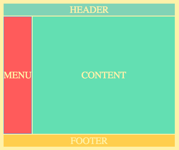
Isn't that cool? It's a very clear way of organizing your layout in a clear visual way.
Now if you want the menu to span all the way to the top like before, you can just switch the first h with an m
.container {
    height: 100%;
    display: grid;
    grid-gap: 3px;
    grid-template-columns: repeat(12, 1fr);
    grid-template-rows: 40px auto 40px;
    grid-template-areas:
        "m h h h h h h h h h h h"
        "m c c c c c c c c c c c"
        "f f f f f f f f f f f f";
}
and now it spans all the way to the top
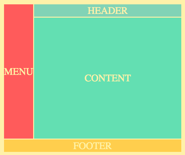
You can also use a . to make a column blank.
.container {
    height: 100%;
    display: grid;
    grid-gap: 3px;
    grid-template-columns: repeat(12, 1fr);
    grid-template-rows: 40px auto 40px;
    grid-template-areas:
        ". h h h h h h h h h h ."
        "m c c c c c c c c c c ."
        ". f f f f f f f f f f .";
}
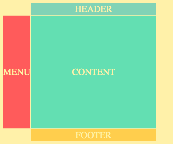
Notice how the spaces above and below the menu are blank and the right column is completely blank all the way down.
You cannot put a . in between letters though.
Your areas also have to be continuous rectangles.
The following code would break the entire layout.
.container {
    height: 100%;
    display: grid;
    grid-gap: 3px;
    grid-template-columns: repeat(12, 1fr);
    grid-template-rows: 40px auto 40px;
    grid-template-areas:
        "h h h h h . h h h h h h"
        "m c c c c . c c c c f c"
        "f f f f f . f f f f f f";
}
This is what our window would look like.

As you can see, it completely ruined it. So keep the .'s on the edges. Also, the f interrupts the continuity of the c rectangle which also ruins the layout.
auto-fit
Let's change our HTML code again to this
<html>
    <head>
        <link rel="stylesheet" href="index.css">
        <link rel="stylesheet" href="style.css">

    </head>
    <body>
        <div class="container">
            <div>1</div>
            <div>2</div>
            <div>3</div>
            <div>4</div>
            <div>5</div>
            <div>6</div>
            <div>7</div>
            <div>8</div>
            <div>9</div>
            <div>10</div>
            <div>11</div>
            <div>12</div>
        </div>
    </body>
</html>
and our CSS to this
.container {
    display: grid;
    grid-gap: 5px;
    grid-template-columns: repeat(6, 100px);
    grid-template-rows: repeat(2, 100px);
}
it should look like this
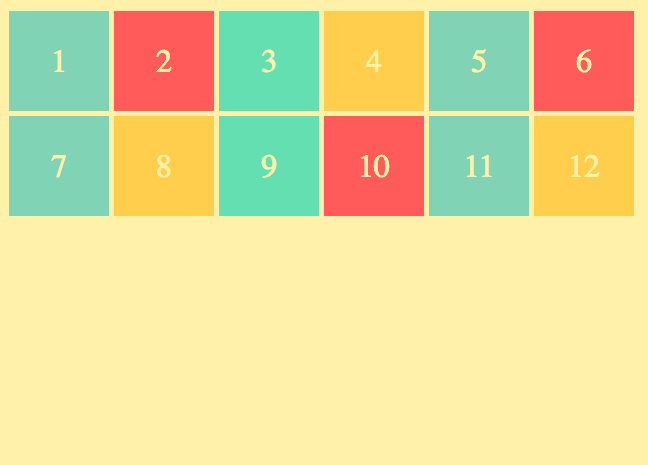
if you make your window bigger and smaller you will see that it is not responsive.
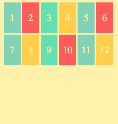
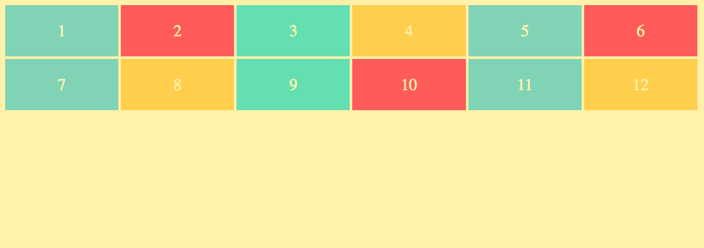
Well couldn't we just change grid-template-columns: repeat(6, 100px); to grid-template-columns: repeat(6, 1fr);?
When we make the screen small it looks like this
and when its large it looks like this
What if you wanted all the containers to be 100px wide and responsive?
That's when you use auto-fit.
.container {
    display: grid;
    grid-gap: 5px;

    **grid-template-columns: repeat(auto-fit, 100px);**

    grid-template-rows: repeat(2, 100px);
}
Below is what the screen would look like at varying sizes.
large screen

medium screen

small screen
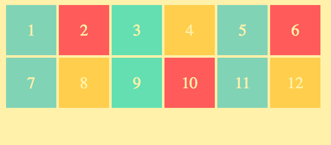
Notice how they just fall into position when there is at least 100px worth of space for them, otherwise they simply fall to the next row.
minmax()
But we are still left with another problem.
We have this awkward spot in between 0-100px where we get this ugly extra space on the side.
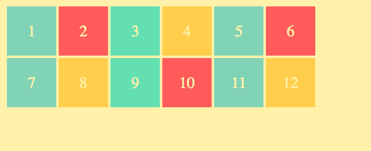
To solve this we will use minmax() like so...
.container {
    display: grid;
    grid-gap: 5px;

    **grid-template-columns: repeat(auto-fit, minmax(100px, 1fr);**

    grid-template-rows: repeat(2, 100px);
}
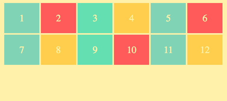
This says that our box's will be a minimum of 100px wide and a maximum of 1fr, thus solving the problem of the unwanted extra space on the side.
This is a screen shot at the exact same screen width I had above just with the new code.
grid-auto-rows
Our problems aren't all solved quite yet, however. You may have noticed that if you make your screen all the way to the smallest size, that it looks like this
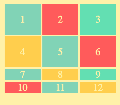
That is because we only have 2 rows defined currently. But since our grid is responsive now it may become difficult to predict how many rows there will be.
So lets go into our CSS and change grid-template-rows to grid-auto-rows
.container {
    display: grid;
    grid-gap: 5px;
    grid-template-columns: repeat(auto-fit, minmax(100px, 1fr);

    **grid-auto-rows: 100px;**
}
Now look at our window
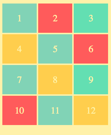
All the rows are now created with the height of 100px!!!

