CSS Box Model

Understanding the CSS box model will help you more as a web designer than just about any one other thing in CSS. Once you understand the difference between inline and block-level elements, the box model will begin to be easier to understand. Each concept is fairly straightforward to understand, so we'll work through a number of examples to illustrate the different pieces of the box model.
Analogy
Imagine yourself inside of a bubble suit or a sumo suit:

We'll be referring to this concept throughout this lesson. Now check the diagram below:
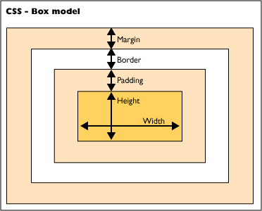
In the diagram you can see each piece of the box model: height/width, padding, border, and margin.
Height/Width
The height and width of an element is the amount of space the content of the element itself takes up. This is not necessarily the same as how much space the whole element takes up. In the bubble suit analogy, this is represented by how much space your actual body takes up. The dimensions of the content can be set by the CSS height and width properties.
Note: While this can be set in the HTML on many elements, this is a bad idea and should be avoided
Padding
An element's padding can be thought of as the additional space the bubble suit adds to the total amount of space you occupy. If there is no padding, it would be like the bubble suit were vacuumed to your body with no additional air between the plastic bubble material and your clothes.
The element's padding is still considered part of the element itself, so as the padding increases, the element gets larger and larger. We can see this with a span element:
<span class="no-padding">I'm skinny</span>
<span class="with-padding">I'm fat</span>
span {
    background-color: #FF4F33;
    color: #F4FEFF;
    border: none;
}

.no-padding {
    padding: 0;
}

.with-padding {
    padding: 30px;
}
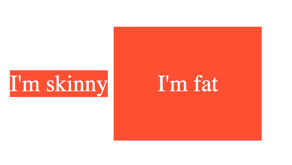
Since <span> elements are inline elements, they naturally want to take up as little space as possible. By default they have no padding. Once we add padding, we can see that the element gets larger in the amount of space it takes up on the page. The text itself determines the height and width of the element, but if we want to extend the size of the element further (including a larger amount of space for the background color), we can use padding to do this.
Border
An element's border is akin to the plastic walls of the bubble suit. It represents the separation between the element itself and any other elements that may be nearby.
<span class="little-border">Little Border</span>
<span class="big-border">Big Border</span>
span {
    background-color: #0FB565;
    color: #F4FEFF;
    padding: 20px;
}

.little-border {
    border: 1px dashed red;
}

.big-border {
    border: 10px dashed red;
}
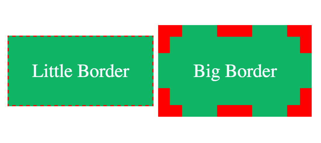
There are a number of things we can do with an element's border, including rounding the corners, changing the border style, etc. Some of the most common properties we change are the border-width, border-color, border-style, and border-radius.
border-widthis simply the thickness of the border itself. In the example above, one has aborder-widthof 1 px, the other 10px.border-coloris the color of the border.border-styleis the pattern of the border. There are a lot of options, all of which can be found here.border-radiusis the roundness of the corners of the border (and the element itself).
You may notice from the above image that the border is traced along the inside of the padding. It is important to note that the border will do this by default. Even if you set the item to have 0 padding, it will create the padding it needs in order for the border to still be sitting inside the element. So if you're trying to use percentages to do math with the width of items on a page, but you're also adding a border (no matter how small), your math won't work out to 100%! The widths of the borders will add just enough to make your items not sit side-by-side.
To remedy this, you'll probably want to add the following to the top of your CSS file:
* {
    box-sizing: border-box;
}
This property takes the width of the border into account when setting the width and height properties, so now you could put 2 objects side-by-side at 50% each without pulling your hair out!
Margin
In our bubble suit analogy, an element's margin would be the space between other people who are also wearing their own bubble suits. The greater the margin, the more space between each person and their suit.
<span>No margin</span>
<span>I'm squished!</span>
span {
    background-color: #F2AD02;
    color: #F4FEFF;
    padding: 10px;
    margin: 0;
}

Note: You'll notice in the image that it still kind of looks like there is a little bit a margin separating the two spans. This has to do with a quirk of HTML obeying whitespace between HTML tags on separate lines, and it doesn't mean that the elements have some margin. If you put the two spans on the same line in the editor (<span>No margin</span><span>I'm squished!</span>), you'll see that small space disappear.
Let's see a more realistic example of when margin should be used: navbar links!
<nav>
    <ul>
        <a href="index.html"><li>Home</li></a>
        <a href="about.html"><li>About</li></a>
        <a href="contact.html"><li>Contact</li></a>
        <a href="donate.html"><li>Donate</li></a>
    </ul>
</nav>
nav li {
    display: inline-block;
    background-color: #3B62F2;
}

nav li > a {
    text-decoration: none;
    color: #F4FEFF;
}

This navbar is really cramped and each link is really small! How would we make each element larger so the user didn't have to be very precise with their mouse? Padding! Remember, padding adds space inside the element so as to make the element's insides larger:
nav li {
    display: inline-block;
    background-color: #3B62F2;
    padding: 10px;
}

If we wanted to move each of these links further apart from one another? This is where margin comes in to play! I could add margin: 10px; to my nav li selector, and that would add a margin of 10px to all 4 sides:

Limitations of margin
Margin shouldn't be used to lay out your page! If you want something to be on the right side of your page, do not add margin-left: 90% to you element! This is the job of the position property. Margin should be used solely for pushing other elements away, usually just by a relatively small amount.
Another example: images and text
It's common to have an image that sits inline with your text. Image tags are inline elements, and text tags are block-level elements, so there's a property that allows our image tags to "float" next to our text. However, because it is still an inline element, it will still try to take up as little space as possible, resulting in this:
<img class="kitten-pic" src="http://placekitten.com/g/200/300" alt="Kitten!">
<div class="kitten-description">
    <p>This is a picture of a kitten. His name is Mr. Pickles, and he is the cuddliest kitten you'll ever meet. However, if you get on his bad side he will shred your skin away, and then shred your couch cushions for good measure.</p>
    <p>It's best not to get on his bad side.</p>
</div>
.kitten-pic {
    float:left;
}
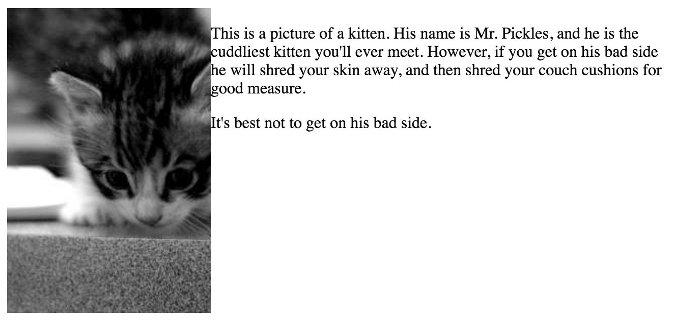
The text is far too close to that kitten! Margin to the rescue.
.kitten-pic {
    float:left;
    margin-right: 15px;
}
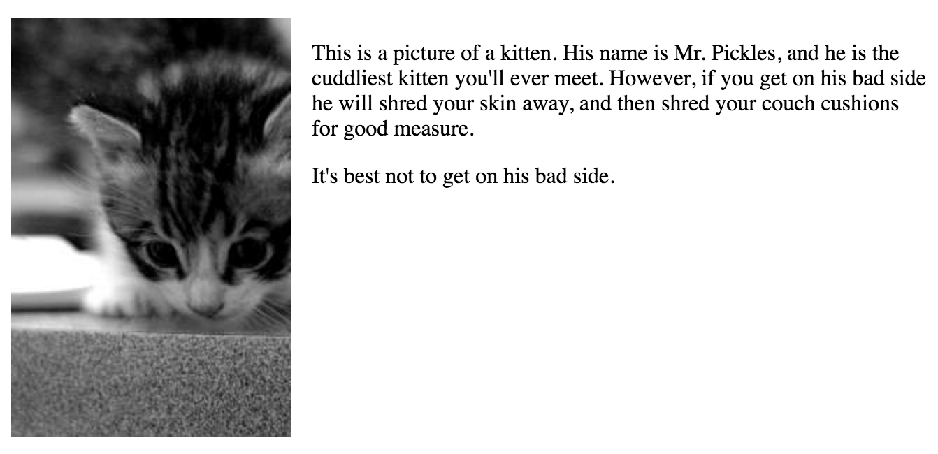
Much better.
Shortcut properties
So far we've been using the shortcut properties padding, border, and margin without explaining what they mean.
Each of those properties have a long-form version that deals with each side individually:
/* Padding */
padding-top: 20px;
padding-right: 20px;
padding-bottom: 20px;
padding-left: 20px;

/* Border */
border-top-width: 2px;
border-right-width: 2px;
border-bottom-width: 2px;
border-left-width: 2px;
border-top-style: dashed;
... etc ...
border-top-color: blue;
... etc ...
border-top-right-radius: 20%;
... etc ...

/* Margin */
margin-top: 20px;
margin-right: 20px;
margin-bottom: 20px;
margin-left: 20px;
We can always use these long-form version of the properties if we need a lot more flexibility, but fortunately we're given the option to shorten all of these.
For padding and margin, we can decide to either put 1, 2, 3, or 4 size values, separated by a space, in the margin or padding property:
margin: 10px;
margin: 10px 20px;
margin: 10px 20px 30px;
margin: 10px 20px 30px 40px;
The order is important: 1) top, 2) right, 3) bottom, and 4) left. With these in mind, the following rules apply:
- If you have a single value:
- Your value applies to all 4 sides
- If you have 2 values:
- The first value applies to the top and bottom sides, and
- The second value applies to the right and left sides.
- If you have 3 values:
- The first value applies to the top side,
- The second value applies to the right and left sides, and
- The third value applies to the bottom side.
- If you have 4 values:
- The order of the values goes, respectively, top, right, bottom, left.
Other shortcut methods follow a different pattern. With borders, for example, the border shortcut method is simply a combination of border-width, border-style, and border-color (in that order), all of which are optional:
border: 3px;
border: dashed;
border: red;
border: 3px red;
border: 3px dashed;
border: solid blue;
border: 3px solid red;
... etc ...
Conclusion
The box model can seem complex and confusing at first. The more time you spend with it, the better you'll get at using it to your advantage.
