Bootstrap's Grid System
CSS is a very powerful and fully-fledged design tool. However, there are a lot of quirks that take years as a web designer to understand and master. Some of the most difficult (or mundane) things to do in CSS include:
- Layout
- Positioning
- Responsive Design
Bootstrap does a lot of that for you.
Bootstrap, the extremely popular CSS framework originally developed by people at Twitter, includes a grid system. Its purpose is to make layout, positioning, and responsive design easy and fun again.
Note: If you're completely unfamiliar with Bootstrap, you should check out both the official documentation as well as this reference post on some of the coolest parts of Bootstrap
Note about Responsive Design
In the past, websites would make an entirely separate web page for their mobile users (oftentimes at m.website-name.com) and redirect mobile users to that mobile version of the site.
Modern web pages, however, use CSS Media Queries to let the browser test the screen size and change CSS styles accordingly. This way, you can write and deploy the website once and just change the styles based on the screen width. Check out some of the following live sites and make sure to resize your browser to see how they change according to screen size:
Media queries in CSS are powerful, but unfortunately they can be difficult and monotonous to work with. Fortunately, this is one of the greatest benefits we get from using Bootstrap's grid system - a built-in solution to responsive design!
Bootstrap's Solution
With Bootstrap's grid system, you should learn to think of every web page as being divided vertically in 12 evenly-spaced columns. It's a very different approach to responsive design than building your own media queries, but once you learn it, it will make your development much faster.
When using the Bootstrap grid system, you have to be sure to stay within their guidelines and rules in order for it to work correctly. The following enumerates the most important of those rules:
-
All pieces of the bootstrap grid are implemented as CSS classes.
-
The
.container(fixed-width) or.container-fluid(full-width) class wraps everything you want to be a part of the grid system. It adds some nice padding to the main content so that it isn't shoved right up against the edge of the screen. -
"Rows" (
<div class="row">) must be placed within the element with the.containeror.container-fluidclass for proper alignment and padding. Rows are meant to section off a horizontal portion of your page (from left to right). -
"Columns" are always directly inside rows. Use rows to create horizontal groups of columns, and nest only columns inside of rows. Only columns may be immediate children of rows.
-
All web page content should be placed within columns.
-
Columns will automatically create gutters (gaps between column content) via padding, except for the
padding-leftof the first column and thepadding-rightof the last column. -
Grid columns are created by specifying how many of the available 12 columns you wish to span. For example, to make three equal-width columns, you would use three
.col-sm-4classes side-by-side.- It may seem at first that we should use
.col-sm-3(since we want 3 columns), but in fact we need to use.col-sm-4instead. This is because the number in the class represents how many columns wide you want your element to be, not how many of the elements you want in a single row. We can have three 4-column-wide sections within a row of 12 columns, since 12 ÷ 3 = 4. - If the number of columns add to more than 12, bootstrap will break the excess column to the next line. If you tried to put two 7-column elements side by side, it would break the second one down to the next line. If you had an 11-column object and tried to put a 2-column object next to it, it also would break down to the next line.
- It may seem at first that we should use
-
Columns are flat (have no height, and thus seem to be invisible) unless some content is put in them or they are given a height manually.
-
The order and nesting of things should be:
container (or container-fluid)
    row
        column
        /column
    /row
/container (or /container-fluid)
- It is possible to nest columns inside other columns. However, in order to do this, you must first put a new row inside the column, and your nested column inside that row.
Below is a more complicated example that follows all the rules. An ending tag will be shown using the / as in (/row)
container
    row
        col
            content
        /col
        col
            row
                col
                    content
                /col
                col
                    content
                /col
            /row
        /col
    /row
/container
In the above example, there are rows nested in rows and columns in columns, but notice that a row is never the immediate child of a row, and a column is never the immediate child of a column.
Also notice that content is only ever inside columns.
The grid
If those rules didn't make sense, don't worry. They are important to have read, but won't completely make sense until you start making your own layouts.
They are meant to be referred to when practicing what you'll learn in the next two sections.
Before we begin, forget most of what you know about rows and columns in a traditional grid. In our case here, columns are just children of rows.
Bootstrap uses 12 columns. No matter how wide your screen is, every row will have 12 columns.

The above is a row with 12 columns inside it. How many columns would we use to cover half of the row?
The answer is 6! Because 6 is half of 12, if we use 6 columns, we would cover the first half of the row.
We would write that like this - and remember that all containers, rows, and columns are bootstrap classes:
<div class="col-xs-6"></div>
To have two elements that span the entire width of the row, we would write the following:
<div class="col-xs-6"></div>
<div class="col-xs-6"></div>
It would look like this:

If we wanted 3 sections to evenly span the entire width of the row, how many columns would they need to take up each?
If you said 4, you're getting it!
Because 12 divided into 3 sections is 4.
How would that be written?
Write it out yourself, and then look at the code block to check your answer.
To buffer the question and answer, here are some more examples of the grid.

And here is how you'd write your 3 columns.
<div class="col-xs-4"></div>
<div class="col-xs-4"></div>
<div class="col-xs-4"></div>
This is starting to help solve our layout and positioning issues. Let's take a break from this stuff and talk about the xs that has been used so far.
This will bring us into-
Responsive Design in Bootstrap!
This is our media query, or in other words, we are checking how big our users screen is.
col-xs-4 is saying "When we have an extra small screen, this element will take up 4 columns, or in other words, a third of the row.
What would col-md-6 be saying?
You probably said, "When we have a medium size screen, this element will take up 6 columns, or half of the row." If you did say that, congratulations! You're correct.
This becomes useful when you use multiple classes in one element. You can control how big an element will be depending on the screen size.
How will the following element act? Make sure you think through it before you read the answer.
<div class="col-lg-2 col-md-4 col-sm-6 col-xs-12"><div>
The element will take up one sixth of the row when it's a large screen, a third on a medium sized screen, one half on a small screen, and the entire row on a small screen.
This is useful because a user will no longer have to scroll all over the place on their laptop to find an element on a page of over sized elements, and the user will not have to zoom in on their phone on a page of tiny elements.
The page will dynamically change depending on the screen size.
The following is a chart of the explaining the differences of the sizes.

One last important feature before we move on. Each column defaults to col-xs-12, and every undefined size will default to the next smallest defined size.
This means the element <div class="col-md-6"></div> will be 6 columns wide at the medium and large sizes, but 12 columns wide at the extra small and small sizes.
How many columns will the following element take up at each size of screen?
<div class="col-sm-6 col-md-8"></div>
How wide at extra small screen size?
How wide at small screen size?
How wide at medium screen size?
How wide at large screen size?
Answers
When the screen is extra small: 12 columns, or 100% of the row with a small screen size.
When the screen is small: 6 columns, or half of the row with a small screen size.
When the screen is medium sized: 8 columns, or 2/3 of the row with a small screen size.
When the screen is large: 8 columns, or 2/3 of the row with a small screen size. The same as medium.
FYI - Bootstrap 4, which is in it's alpha phase as of now, will have an Extra Large screen size.
A Few More Important Rules/Tricks
Column wrapping
Consecutive columns will position themselves inline (horizontally) until they fill a row.
This means the following:
<div class="col-md-8"></div>
<div class="col-md-4"></div>
<div class="col-md-4"></div>
<div class="col-md-4"></div>
<div class="col-md-4"></div>
Will look like:

And this:
<div class="col-xs-9"></div>
<div class="col-xs-4"></div>
<div class="col-xs-6"></div>
Will look like:

Offsetting columns
Move columns to the right using .col-**-offset-* classes, where ** is the size (xs,sm,md,lg), and * is the number of columns. These classes increase the left margin of a column by * columns. For example, .col-**-offset-4 moves .col-**-4 over four columns.

<div class="row">
  <div class="col-md-4">.col-md-4</div>
  <div class="col-md-4 col-md-offset-4">.col-md-4 .col-md-offset-4</div>
</div>
<div class="row">
  <div class="col-md-3 col-md-offset-3">.col-md-3 .col-md-offset-3</div>
  <div class="col-md-3 col-md-offset-3">.col-md-3 .col-md-offset-3</div>
</div>
<div class="row">
  <div class="col-md-6 col-md-offset-3">.col-md-6 .col-md-offset-3</div>
</div>
You can also overwrite offsets from lower grid tiers with .col-*-offset-0 classes.
<div class="row">
  <div class="col-xs-6 col-sm-4">
  </div>
  <div class="col-xs-6 col-sm-4">
  </div>
  <div class="col-xs-6 col-xs-offset-3 col-sm-4 col-sm-offset-0">
  </div>
</div>
The Role of Rows
There are a few reasons to use rows.
Reason 1: Starting our column wrapping over
Here is a quick review and quiz to set us up for learning about the importance of rows.
Imagine what the following would look like on a small screen, and then what it would look like on a large screen:
In most of our example up to now, the container and row have been assumed. In this example, we will make it explicit.
<div class="container">
    <div class="row">
        <div class="col-xs-6 col-md-4"></div>
        <div class="col-xs-4 col-md-3"></div>
        <div class="col-xs-4 col-md-3"></div>
        <div class="col-xs-3 col-md-2"></div>
    </div>
</div>
How many layers of columns do we have on a small screen?
Two layers. The first spanning 10 columns (6 + 4), and the second spanning 7 columns (6 + 3)
The third column needs to move down because it cannot fit within the 12 given columns and undergoes column wrapping like we learned about earlier.
On a large screen, it would be one layer spanning the entire width of the screen.
4 + 3 + 3 + 2 = 12
For small screen:

Versus:

For large screen
Here is the point of this section:
If we wanted to take up two layers on both the small and large screen, we use rows.
We change the above code to:
<div class="container">
  <div class="row">
    <div class="col-xs-6 col-md-4"></div>
    <div class="col-xs-4 col-md-3"></div>
  </div>
  <div class="row">
    <div class="col-xs-4 col-md-3"></div>
    <div class="col-xs-3 col-md-2"></div>
  </div>
</div>
Then, for the small screen we can have:

Versus:

For large screen
Yep, they look similar. That's the point.
Many times we wouldn't want this, so we would keep them in one row. Sometimes we would want this, so we would put them in two separate rows.
Reason 2: More complicated organization
Many web sites have a nav bar on the left. Our first level of organization for this would be easy. Two columns. The first (the vertical nav bar) would be narrow, maybe a couple column widths wide. And the second would fill the rest of the screen.
<div class="container">
    <div class="row">
      <div class="height col-xs-2">col-xs-2</div>
      <div class="height col-xs-10">col-xs-10</div>
    </div>
  </div>

Now, lets put some content in the main sections of our page.
It's going to be much easier to code, and make much more organizational sense if we are able to pretend that the main content is the same as the entire screen.
Besides having to work within the confines of the remaining 10 columns for the rest of the content, there are other issues we would have to deal with unless we nest our row inside our column. Like this:
<div class="container">
    <div class="row">
      <div class="col-xs-2">col-xs-2</div>
      <div class="col-xs-10">col-xs-10
        <div class="row">
          <div class="title-box col-xs-6 col-xs-offset-3>
            <h1>
              This is the Title Box
            </h1>
          </div>
        </div>
      </div>
    </div>
  </div>

Notice that our title box is the half the width of the main column, and not the entire screen. The offset is a cool 3 columns.
Fun and easy!
Conclusion
Bootstrap's grid system is responsive, and the columns will re-arrange depending on the screen size: On a big screen it might look better with the content organized in three columns, but on a small screen it would be better if the content items were stacked on top of each other.
The Bootstrap grid system has four classes:
xs (for phones)
sm (for tablets)
md (for desktops)
lg (for larger desktops)
The classes above can be combined to create more dynamic and flexible layouts.
Each class scales up, so if you wish to set the same widths for xs and sm, you only need to specify xs.
Contain everything in one container, and organize your columns in nested in rows, and rows nested in columns.
Examples
You've finished with the lesson! Nice work. That is a lot of material to go through. Things will quickly start to click as you practice using the grid system.
The following is a list of examples and what they look like. You may refer to it as you wish. Do not copy and paste the code. Make sure you practice bootstrap from scratch.
If you do use it as a resource for your own projects, make sure you understand the why of everything.
Don't shortchange your education!!
Other CSS classes were removed (to give border, height, and color) from the code to help us focus on the bootstrap.
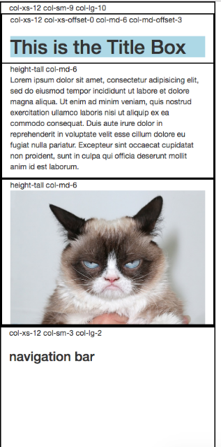
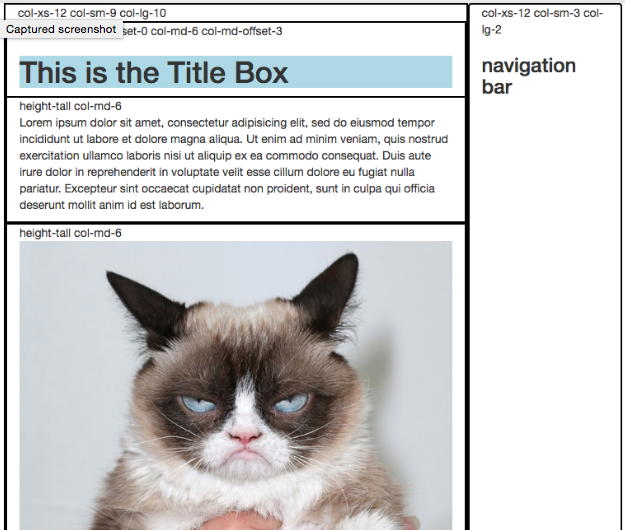
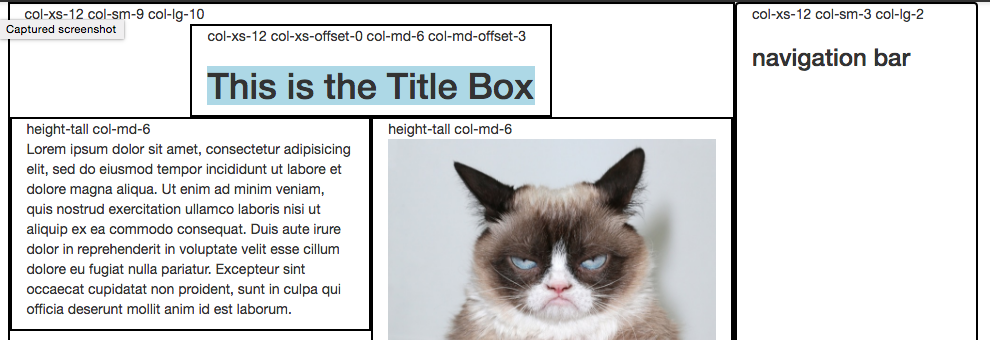
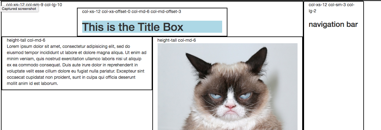
First Example
Extra Small (A phone)

Small (tablet)

Medium

Large

<div class="container">
    <div class="row">
      <div class="col-xs-12 col-sm-9 col-lg-10">col-xs-12 col-sm-9 col-lg-10
        <div class="row">
          <div class="col-xs-12 col-xs-offset-0 col-md-6 col-md-offset-3">col-xs-12 col-xs-offset-0 col-md-6 col-md-offset-3
            <h1>
              This is the Title Box
            </h1>
          </div>
          <div class="col-md-6">height-tall col-md-6
            <p>Lorem ipsum...</p>
          </div>
          <div class="col-md-6">height-tall col-md-6
            <image style="width: 100%; height: 100%"  src="http://images.lifeandstylemag.com/uploads/posts/image/47360/grumpy-cat.jpg?crop=top&fit=clip&h=500&w=698">
          </div>
        </div>

      </div>
      <div class="col-xs-12 col-sm-3 col-lg-2">col-xs-12 col-sm-3 col-lg-2
        <h3>navigation bar</h3>
      </div>

    </div>
  </div>

