Bootstrap Navbar
Bootstrap provides a broad variety of useful tools which not only decrease the amount of time you spend writing code, but also increase the aesthetic appeal of your webpage.
Something almost every website you create will have is a navbar. Lucky for us bootstrap comes with a navbar which we can import and then alter to our liking. This tutorial will walk you step by step through the navbar installment process.
The first thing you will do after opening a new html document in your text editor is going to the links below and copying both the JavaScript and CSS Bootstrap CDN's and the jQuery CDN into your code like this.
https://www.bootstrapcdn.com/ << for Bootstrap CDN's
https://code.jquery.com/ << for jQuery CDN
<!DOCTYPE html>
<html lang="en">
<head>
    <meta charset="UTF-8">
    <title>Navbar Tutorial</title>

    <!-- CSS Bootstrap CDN -->
    <link rel="stylesheet" href="https://maxcdn.bootstrapcdn.com/bootstrap/3.3.7/css/bootstrap.min.css">
</head>
<body>


    <!-- jQuery CDN -->
   <script src="https://ajax.googleapis.com/ajax/libs/jquery/3.2.1/jquery.min.js"></script>

    <!-- JavaScript Bootstrap CDN -->
    <script src='https://maxcdn.bootstrapcdn.com/bootstrap/3.3.7/js/bootstrap.min.js'></script>
</body>
</html>
Next, go to this link and copy the code written under Default navbar and paste it into your code like this.
<!DOCTYPE html>
<html lang="en">
<head>
    <meta charset="UTF-8">
    <title>Navbar Tutorial</title>

    <!-- CSS Bootstrap CDN -->
    <link rel="stylesheet" href="https://maxcdn.bootstrapcdn.com/bootstrap/3.3.7/css/bootstrap.min.css">
</head>
<body>

    <!-- PASTE CODE BELOW THIS LINE -->

    <nav class="navbar navbar-default">
  <div class="container-fluid">
    <!-- Brand and toggle get grouped for better mobile display -->
    <div class="navbar-header">
      <button type="button" class="navbar-toggle collapsed" data-toggle="collapse" data-target="#bs-example-navbar-collapse-1" aria-expanded="false">
        <span class="sr-only">Toggle navigation</span>
        <span class="icon-bar"></span>
        <span class="icon-bar"></span>
        <span class="icon-bar"></span>
      </button>
      <a class="navbar-brand" href="#">Brand</a>
    </div>

    <!-- Collect the nav links, forms, and other content for toggling -->
    <div class="collapse navbar-collapse" id="bs-example-navbar-collapse-1">
      <ul class="nav navbar-nav">
        <li class="active"><a href="#">Link <span class="sr-only">(current)</span></a></li>
        <li><a href="#">Link</a></li>
        <li class="dropdown">
          <a href="#" class="dropdown-toggle" data-toggle="dropdown" role="button" aria-haspopup="true" aria-expanded="false">Dropdown <span class="caret"></span></a>
          <ul class="dropdown-menu">
            <li><a href="#">Action</a></li>
            <li><a href="#">Another action</a></li>
            <li><a href="#">Something else here</a></li>
            <li role="separator" class="divider"></li>
            <li><a href="#">Separated link</a></li>
            <li role="separator" class="divider"></li>
            <li><a href="#">One more separated link</a></li>
          </ul>
        </li>
      </ul>
      <form class="navbar-form navbar-left">
        <div class="form-group">
          <input type="text" class="form-control" placeholder="Search">
        </div>
        <button type="submit" class="btn btn-default">Submit</button>
      </form>
      <ul class="nav navbar-nav navbar-right">
        <li><a href="#">Link</a></li>
        <li class="dropdown">
          <a href="#" class="dropdown-toggle" data-toggle="dropdown" role="button" aria-haspopup="true" aria-expanded="false">Dropdown <span class="caret"></span></a>
          <ul class="dropdown-menu">
            <li><a href="#">Action</a></li>
            <li><a href="#">Another action</a></li>
            <li><a href="#">Something else here</a></li>
            <li role="separator" class="divider"></li>
            <li><a href="#">Separated link</a></li>
          </ul>
        </li>
      </ul>
    </div><!-- /.navbar-collapse -->
  </div><!-- /.container-fluid -->
</nav>

    <!-- JavaScript Bootstrap CDN -->
    <script src='https://maxcdn.bootstrapcdn.com/bootstrap/3.3.7/js/bootstrap.min.js'></script>
</body>
</html>
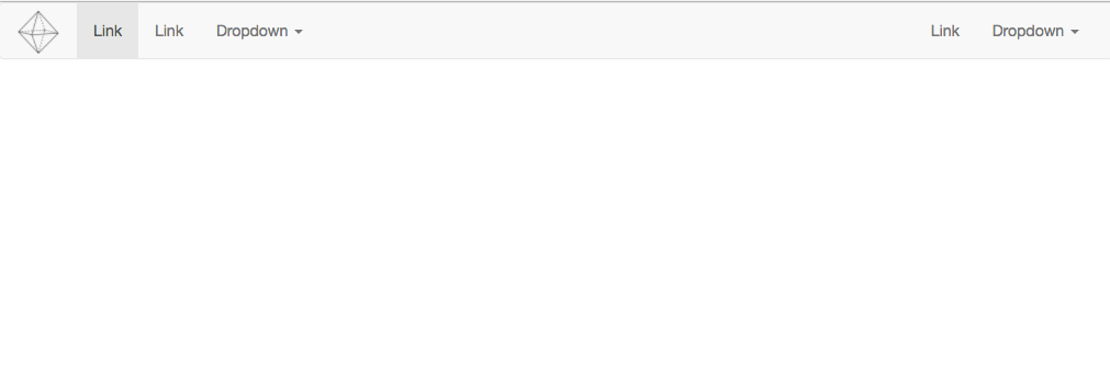
Now if you look at your live preview you will see that you have a responsive navbar with some dropdown menus, some links, a search bar, and a place to put your logo.
it should look like this

Let's break it down now piece by piece to see what all this code is doing and how we can adjust it to our liking.
First, we will start with the Brand image, or the spot where we will put our logo.
Find the code block that looks like this
<nav class="navbar navbar-default">
  <div class="container-fluid">
    <!-- Brand and toggle get grouped for better mobile display -->
    <div class="navbar-header">
      <button type="button" class="navbar-toggle collapsed" data-toggle="collapse" data-target="#bs-example-navbar-collapse-1" aria-expanded="false">
        <span class="sr-only">Toggle navigation</span>
        <span class="icon-bar"></span>
        <span class="icon-bar"></span>
        <span class="icon-bar"></span>
      </button>
      <a class="navbar-brand" href="#">Brand</a> <!-- We are going to use this line -->
    </div>
Inside of the <a> tag you will add your logo image or Name like this
<a class="navbar-brand" href="#">
    <img src="{insert image address here}" alt="">
</a>
You can do the same thing with pretty much all the different sections, You can delete features that you don't plan on using. As an example, let's delete the Search Bar together.
Find the block of code with the Search Bar content that looks like this
<form class="navbar-form navbar-left">
        <div class="form-group">
          <input type="text" class="form-control" placeholder="Search">
        </div>
        <button type="submit" class="btn btn-default">Submit</button>
      </form>
Then simply delete it.
Your new navbar should look something like this.

You can now make a navbar using Bootstrap and customize it to your liking.

