Transitions with react-transition-group
This article is intended to help you build meaningful transitions into your applications. While it is extremely easy to overdo it with animations and transitions, they can also add a professional feel when done correctly. This article will use the react-transition-group module.
Note: Each of the components provided by this library create a
state machineto power the animations. While this can be very helpful with certain transitions, CSS animations can do most of what you need for simple transitions.
Before reading this article, you should have a grasp of react props, state, and dynamic rendering. If you haven't, here are our write-ups on those topics:
What will react-transition-group help me with?
- Allows you to declare transitions and animations to happen when a component is mounting/unmounting, has new information given to it(new props), or is toggled off and on.
- There are two parts to creating these transitions. You will need to use the component (provided by the module), and then either write CSS styles or JS style objects to power the transition.
- If you want to follow along, create a
animation-practicefolder in exercises and install a newcreate-react-app - npm install
react-transition-group - Create your
index.jsandApp.js, then create an empty Class component in theApp.js.
- If you want to follow along, create a
In this write-up, play around with the settings, break stuff, do a different transition. Just like anything else, you'll get better at these the more you play with them!
Let's get started!
Three main Components provided by the react-transition-group API are:
- Transition
- CSSTransition
- TransitionGroup
<Transition />
The <Transition> component allows you to describe transitions from one component state to another. Its a small state machine that powers animations (that you code) on a component's mounting/unmouting and toggling allowing you to declare how the component should enter/exit the view.
The Transition component gives you access to 4 main states of the specified child components life-cycle and labels them the following:
- entering
- entered
- exiting
- exited
It is up to you as the animator to describe what the css of the transition states should look like, and the Transition component will help apply them at the appropriate time.
In this article we will write both js style objects and standard css classes. For the Transition component, we will write js objects.
The Transition component can take a few different props, so we'll look at some of them with the example. Here is the starting point, note we are importing { Transition } from 'react-transition-group', and we also have a toggle function that switches bool in state to be true or false when we click the button:
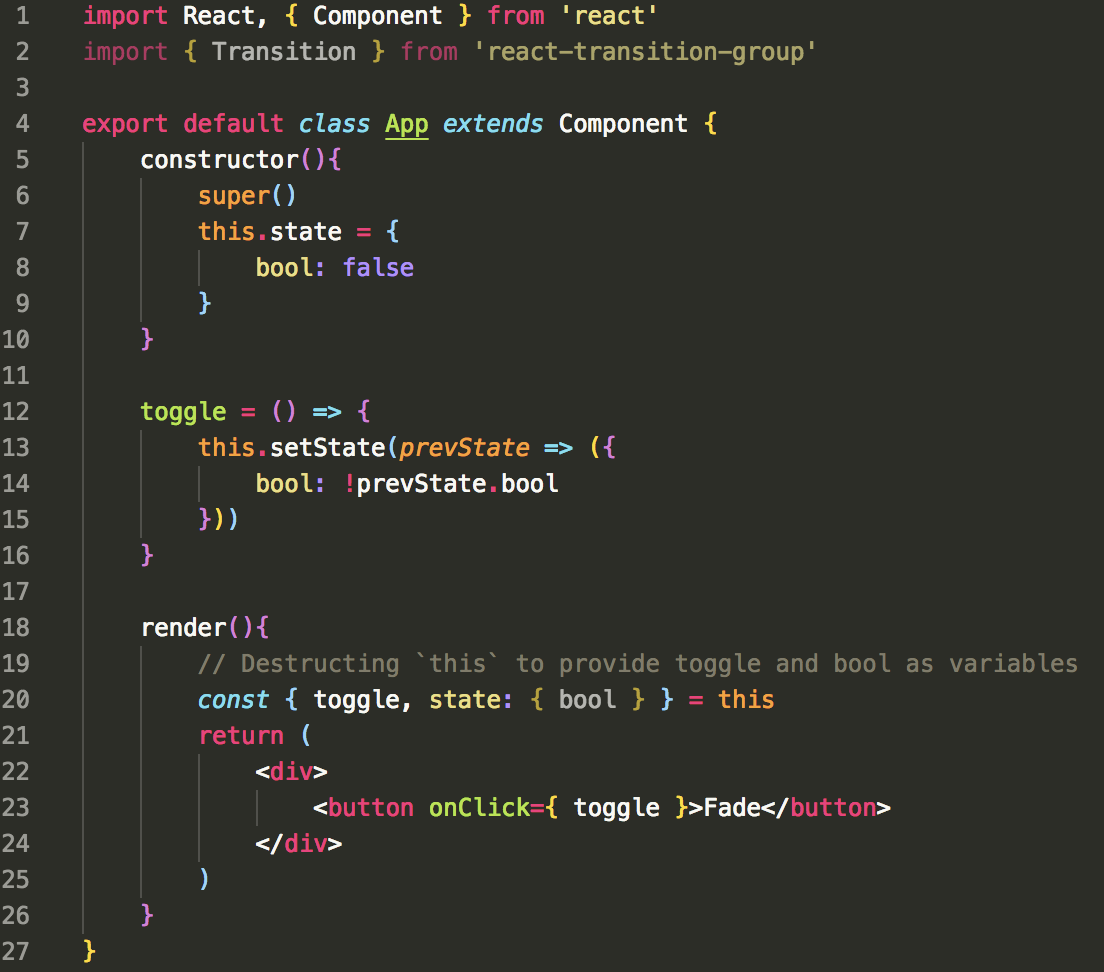
Fade Transition
For this example we will build a fade transition that fades in when the transition's in prop is set to true, and fades out when that prop gets set to false. Using the previous setup, make these changes to the render method in App:
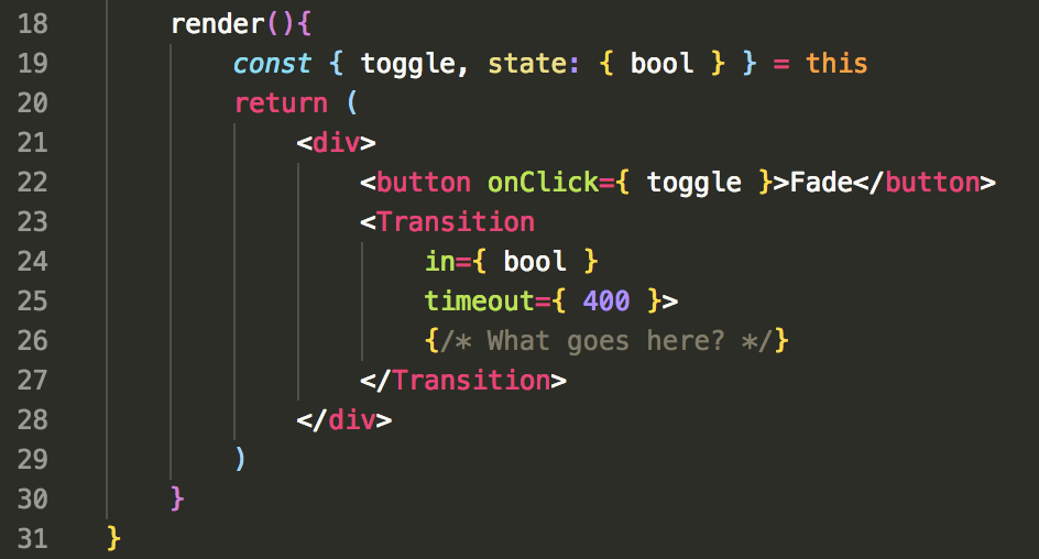
-in-
In is the prop needed to tell the Transition to trigger the enter or exit animation. It's pretty simple, true === entering, false === exiting. So far you have probably dynamically rendered elements using a boolean and a conditional statement like this:

When using an animation to toggle the view, you do not conditionally render the element, rather you give the on/off functionality to the Transition using the in prop and then write the styles that control the on/off appearance.
-timeout-
This is the amount in miliseconds for the transition to last. If given a single value, both the enter and exit transitions will have the same duration. You can specify them separately in the timeout prop by giving it an object with an enter and exit property.
- eg: timeout={{ enter: 300, exit: 500 }}
Important note about
timeoutOn the Component itself (<Transition />, <CSSTransition/>), the timeout property set is the FULL amount of time needed to execute the transition. Meaning, if your transition looked liked this:
You have declared that the animation should last 1 second and the Component's
timeoutprop should be set to 1000. The fourth property declared in that transition is the delay, so once that time is done it then triggers the actual transition.
Wrapped inside of the Transition component is a callback function that returns a JSX element or Component. This callback if fired on the entering, entered, exiting, exited points of the wrapped element, and the literal status string is passed as an argument. eg:
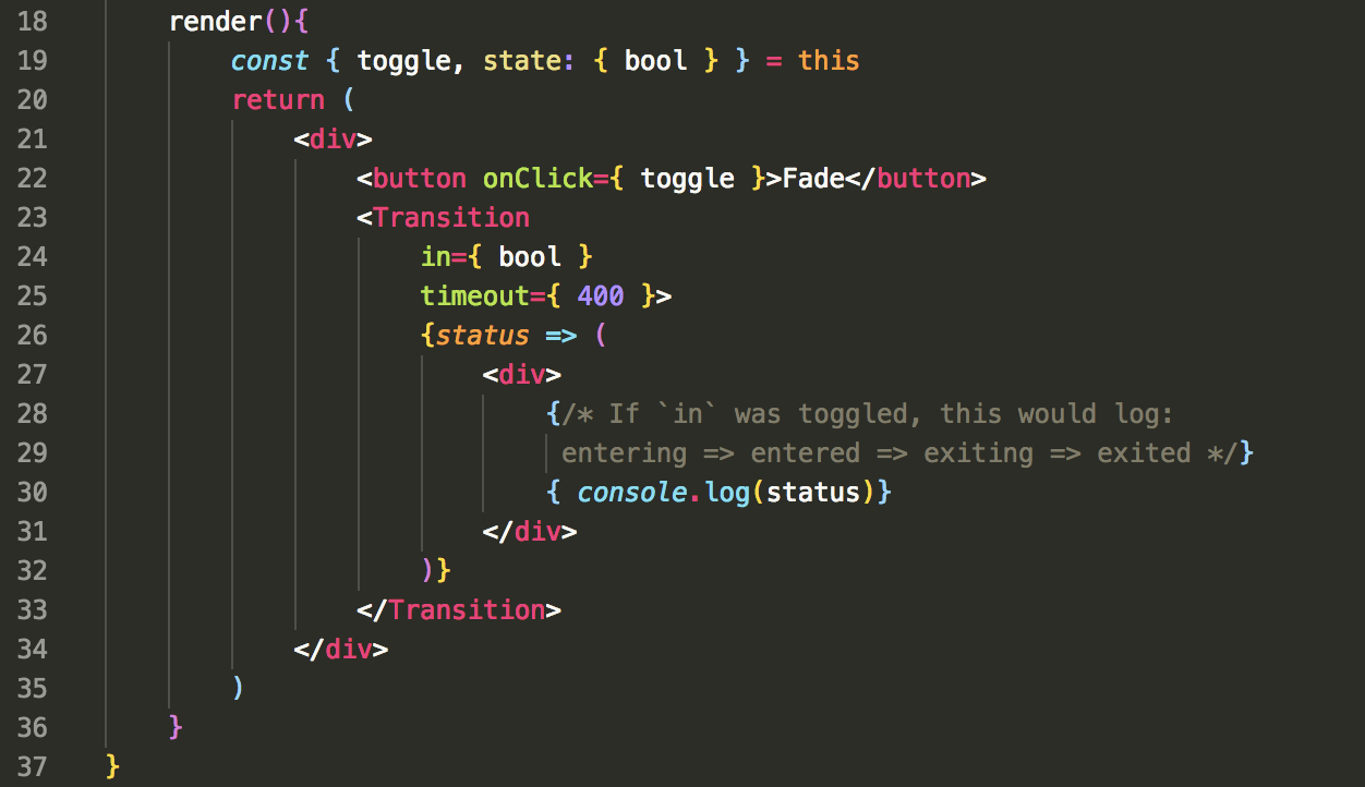
This is useful as we can provide a style object with keys that match the four statuses to have specific styles applied in the 4 states. We will need to create two style objects to power the transition. We'll call these defaultStyle and transitionStyles. Add the following objects above your class App declaration in the App.js file.
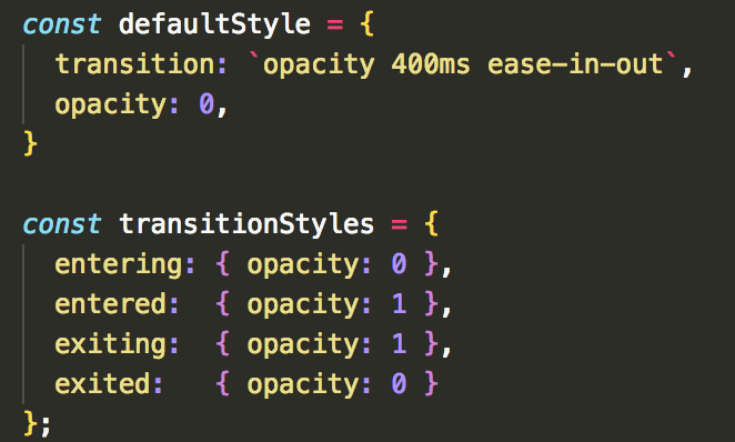
Now we just need to provide these styles to the containing div so it can dynamically use the current status. The syntax may look a bit funny, but we'll talk about it next:
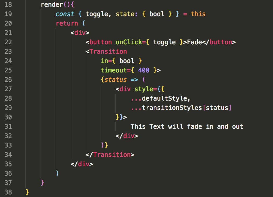
If you click the button, you should now see the text inside of the div fade in and out! But how is this happening exactly?
First we provided an inline-style object to the div. Then we spread the contents of the defaultStyle and transitionStyles, selecting the specific transitionStyle with the passed in status.
Fortunate for us, create-react-app uses babel so we can use the ... spread operator on objects (Not currently supported in Node). Since status will be one of the 4 states (entering, exiting, etc.), the default style and the specific status style are provided to the div on each callback by using the [status] syntax to pull the specific key from the spread transitionStyles object.
Other props
The Transition component can take a variety of other props other than just the in and timeout props we have been using. Most importantly the appear={bool} prop can be used to trigger an animation on a components initial mount, such as a transition that plays automatically when the page first loads.
The majority of the other props available all take a callback function to run at a specific time in the lifecycle of the Transition. The callback will supply the DOM node for you to manipulate. For example using our Fade transition, I could add the following:
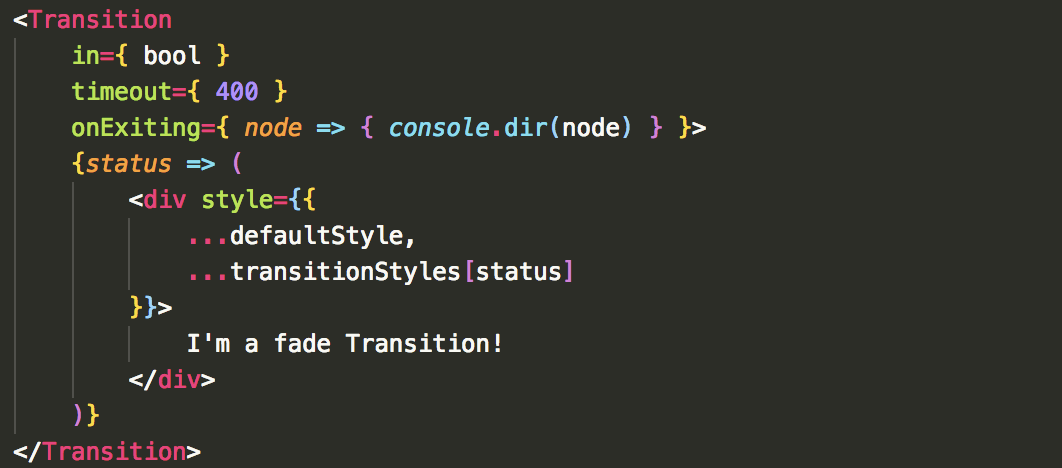
If you check this in the console, you should see a div object with all of it's properties.
If you want more information:
Click here for the Transition DOCs
<CSSTransition />
The <CSSTransition> component is used much like the <Transition> component, but it makes more complex transitions more predictable as it forces reflows. The <Transition> component does not, but can be used to power most simple transitions.
The main difference with this component is that it uses CSS stylesheet classes to write the transition.
To demonstrate this component, we'll use the following starter code.
import React, { Component } from 'react'
import { CSSTransition } from 'react-transition-group'

export default class CSSExample extends Component {
    constructor(){
        super()
        this.state = {
            contacts: ['Harry', 'Ron', 'Hermoine', 'Hagrid', 'Hedwig'],
            count: 0
        }
    }

    // Increment `count` by 1 if `count !== contacts.length`
        // else: resets back to first contact
    nextContact = () => {
        const l = this.state.contacts.length - 1
        if(this.state.count !== l){
            this.setState(prevState => ({
                count: prevState.count + 1,
                currentContact: prevState.contacts[prevState.count + 1]
            }))
        } else {
            this.setState(prevState => ({
                count: 0,
                currentContact: prevState.contacts[0]
            }))
        }
    }

    render(){
        const { count, currentContact } = this.state
        const styles = {
            container: { display: 'flex', justifyContent: 'center', width: '100vw', height: 300 },
            btn: { width: '100%', display: 'flex', justifyContent: 'center' }
        }

        return (
            <div>
                <div style={ styles.container }>
                    {/* <CSSTransition> */}
                    <h1>{ currentContact }</h1>
                    {/* </CSSTransition> */}
                </div>
                <div style={ styles.btn }>
                    <button onClick={ this.nextContact }>next</button>
                </div>
            </div>
        )
    }
}
If you npm start with this component being used, the button increments the count in state which updates the current contact being displayed in the <h1>. We will use the CSSTransition Component to have the current name slide out to the right, and the new name slide in from the left. Take a minute to look at the code and make sure you understand how it works.
Slide Transition
In this component, uncomment the two <CSSTransition> components and then add the following inside of the opening tag:
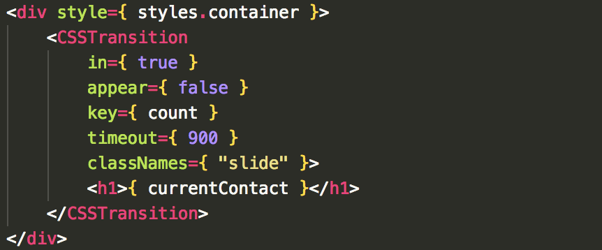
Let's take a look at these props:
in: This works the same as it does with the <Transition> component. However we are not going to use this prop to power the off and on for this transition, so we will hard code it to true. in is great for a toggling transition whether you use <Transition> or <CSSTransition>, but the slide transition doesn't turn off. The old version of the text is swapped out, and the new version of the text is swapped in, so the transition stays on to power the enter/exit animations.
appear: This says to run the appear transition when the element first loads. We'll set this to false as we only want it to trigger when we click the button. (The default is false)
key: This is necessary whenever you are trying to manage the transition of more than one item. React Transition Group uses this key the same way React uses a key when you map a list. We are providing the count as the key since we know it will be unique, but typically you will want to save and id or other guaranteed unique variable.
timeout: Works exactly like the <Transition> timeout
classNames: Notice the 's' at the end, it is important! We give the classNames prop the string representing a CSS class. We will write the CSS to power this transition next with the base class of "slide". The CSSTransition component will use this classNames prop to add the appropriate CSS class extensions onto our base class at the appropriate time. Using our base class of "slide", these are the classes we can define:
/* `-appear` and all other extensions is added by CSSTransition component */
    .slide-appear { }
    .slide-appear.slide-appear-active { }
    .slide-enter { }
    .slide-enter.slide-enter-active { }
    .slide-exit { }
    .slide-exit-active { }
Let's go write these now in CSS. Create a transitions.css file and import it at the top of your component page.
In that CSS Sheet, we'll declare the appearing, entering, and exiting transitions. Copy this code in the CSS page and we'll take a look at it:
/* ENTER TRANSITION */
/* Declare transition start properties*/
.slide-enter {
    transform: translateX(-100vw);
    opacity: 0;
    position: absolute;

}

/* Declare transition properties */
.slide-enter.slide-enter-active {
    transform: translateX(0);
    opacity: 1;
    transition: all 300ms linear 300ms;
}

/* EXIT TRANSITION */
.slide-exit {
    transform: translateX(0);
    opacity: 1;

}

.slide-exit.slide-exit-active {
    transform: translateX(100vw);
    opacity: 0;
    transition: all 300ms linear
}
Take a look at the .slide-enter and .slide-enter.slide-enter-active classes. .slide-enter is the initial state when the element is entering the view, and the .slide-enter.slide-enter-active declares what the final point should be, and how to power the transition. This pattern is the same for .slide-appear and .slide-exit.
Both .slide-appear, .slide-enter and .slide-exit can be given a -done class, for example: .slide-enter-done. This can be used if you need the style of the transition to persist once the transition is completed.
We are using transform to move our elements from left to right. At enter, the element starts off the screen view (-100vw - 'view width'), and is translated to 0 on the X axis (left to right where 0 is it's normal position in the view). Likewise the exit begins at 0 and translates 100vw to the right.
The position absolute is needed on this since we will be having two elements on the page at the same time during the transition. This often can cause the issue of them forcing each other out of the way causing unexpected transition movement. By giving absolute positioning to these items during transition, they can 'float' on top of or next to each other with no conflicts.
Lastly, remember the total time of the transition as stated in our CSSTransition component in 900ms. We are splitting this time up into three 300ms segements. First the exit transition runs immediately for 300ms. Meanwhile, the enter transition waits (delays) for 600ms, and then executes it's transition for 300ms. With the exit/enter transitions firing at the same time, the total is 900ms.
Well we have all the information needed now to power the transition, but why does it still not work?
<TransitionGroup />
The final component <TransitionGroup> needs to be wrapped around any <CSSTransition> or <Transition> component that is managing the entry and exit simultaneously of multiple components (as opposed to the on/off functionality of our fade transition). This means we would use this wrapper as well if we were mapping out a list transitioned components.
Go back to your component and replace the div you have wrapped around the <CSSTransition> component in the <TransitionGroup> component. Make sure you include it in the imports at the top of the page. Then move the style tag from the div and put it in the the TransitionGroup component. It should look like this:
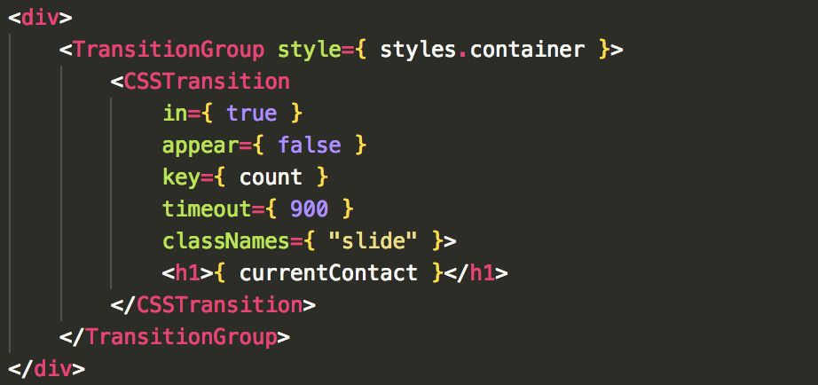
Now you should see the name slide on and off of the page!
A couple of important notes about the <TransitionGroup> component:
-
It takes no transition properties itself, rather it is a
state machinethat manages the list of individual <CSSTransition> or <Transition> wrapped elements. -
This component creates a
divby default, which is why we could give thestyletag to it. This means you can delete thedivyou have wrapping the <TransitionGroup> and it won't change a thing.
* You can overwrite this by providing acomponent={ null }prop.
Want more info on the CSSTransition component? Click Here!
Want more info on the TransitionGroup component? Click Here!
Make it modular
Since these components take a few props to power, they unfornately take a good amount of screen space, especially if you are using an js style object! Using import export, let's look at how we could store these separately and reuse them in our application.
Looking at our slide transition, how could we move it and make it reusable?
To do this, you could either create a <Slide> shared component file, or create an animations.js file where you export multiple different transition components you write.
Either way, this is how the component would look in another file:
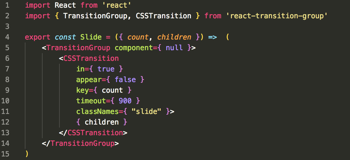
Then where we previously had the transition declared, we would import { Slide } and use it like this:
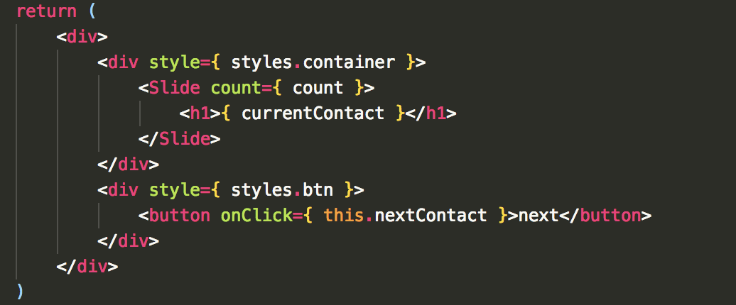
Notice that the Slide function returns { children } which simply represents any element/Component passed inbetween the <Slide></Slide> tags. We also provided the component prop to make sure it didn't automatically create a div for us. With this pattern hopefully you can see that we could also provide the classNames, in, appear, key, timeout, etc. all as props and then this would increase its reusability.
Additional Use Examples
- Transitioning a mapped list
- Transitioning SPA views in
react-router-dom
Transition multiple elements at a time with .map()
If you wanted to have a list of elements all transition on and off of the page, you can combine <TransitionGroup> and <CSSTransition> or <Transition> in a map to achieve this.
Using the same array of contacts, I've changed the render method to display the following:
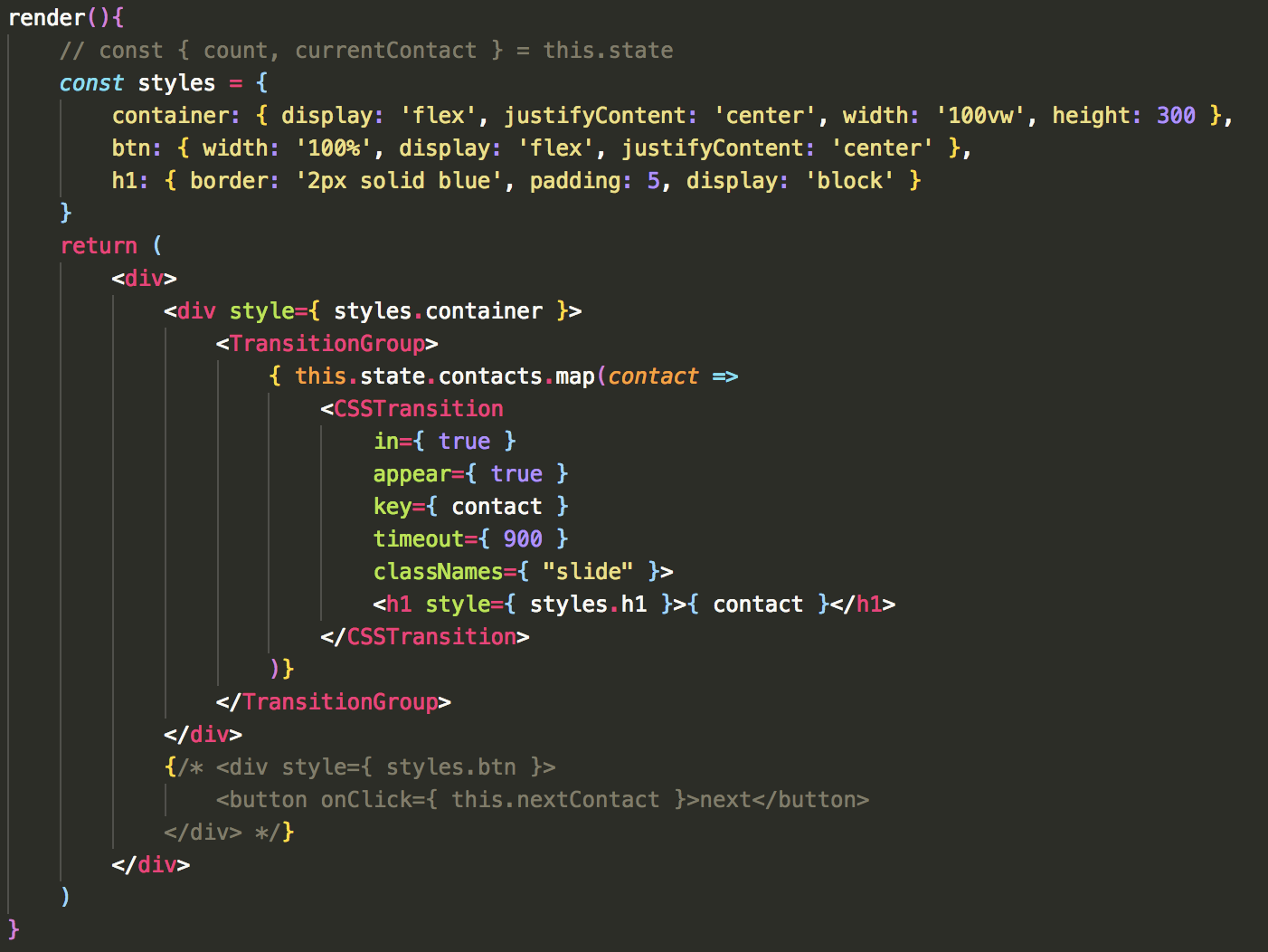
Then to see the list slide in appropriately, comment out the position: absolute on the .slide css. This is a ruff example to show the syntax of transitioning a list. The nice thing with this mapped transition list is that any item added or removed will individually transition in and out. Also, you can use the <Transition> component the same way we are using the <CSSTransition> within the map
Transition page views in react-router-dom
A transition many consumers expect is a page transition. It's abrupt to have the view flicker to the new render. It would be much better if we could introduce a small transition to let the user know the page has changed or been updated. The following is a basic Switch with react-router-dom. We'll add the transition to it next. If you are following along, make sure to install react-router-dom and in your index.js, just use the <SPATransition /> component in the render, and then wrap it in the <BrowserRouter> tags.
import React from 'react'
import { Switch, Route, withRouter, Link } from 'react-router-dom'
import { TransitionGroup, CSSTransition } from 'react-transition-group'
import Page1 from './Page1'
import Page2 from './Page2'
import Page3 from './Page3'
import './pagestyle.css'

const SPATransition = props => {
    const { location } = props
    const styles = {
        nav: { width: '100%', height: 30, display: 'flex', justifyContent: 'space-around' }
    }
    return (
        <div>
            <div style={ styles.nav }>
                <Link to="/">Page1</Link>
                <Link to="/page2">Page2</Link>
                <Link to="/page3">Page3</Link>
            </div>
                <Switch>
                    <Route exact path="/" component={ Page1 } />
                    <Route path="/page2"  component={ Page2 } />
                    <Route path="/page3"  component={ Page3 } />
                </Switch>
        </div>
    )
}

export default withRouter(SPATransition)
The components Page1, 2, and 3 all look like this:
import React from 'react';

const Page1 = () => {
    return (
        <div className="page1">

        </div>
    );
}

export default Page1;
And my CSS sheet looks like this:
.page1,
.page2,
.page3 {
    width: 100vw;
    height: 100vh;
}

.page1 { background-color: dodgerblue }
.page2 { background-color: violet }
.page3 { background-color: firebrick }
Notice we are importing { withRouter } and destructuring { location } out of props. As you recall, when managing the transition of more than one element at a time, the Component needs to be given a key. Well when managing which route is currently being displayed, the location object keeps track of this. The location for each route has a specific key given to it by react-router-dom, so we will use that as our unique identifier.
Now, wrap the <Switch> statement in a <TransitionGroup> & <CSSTransition> component. Then give the CSSTransition it's needed props, it should look like this:
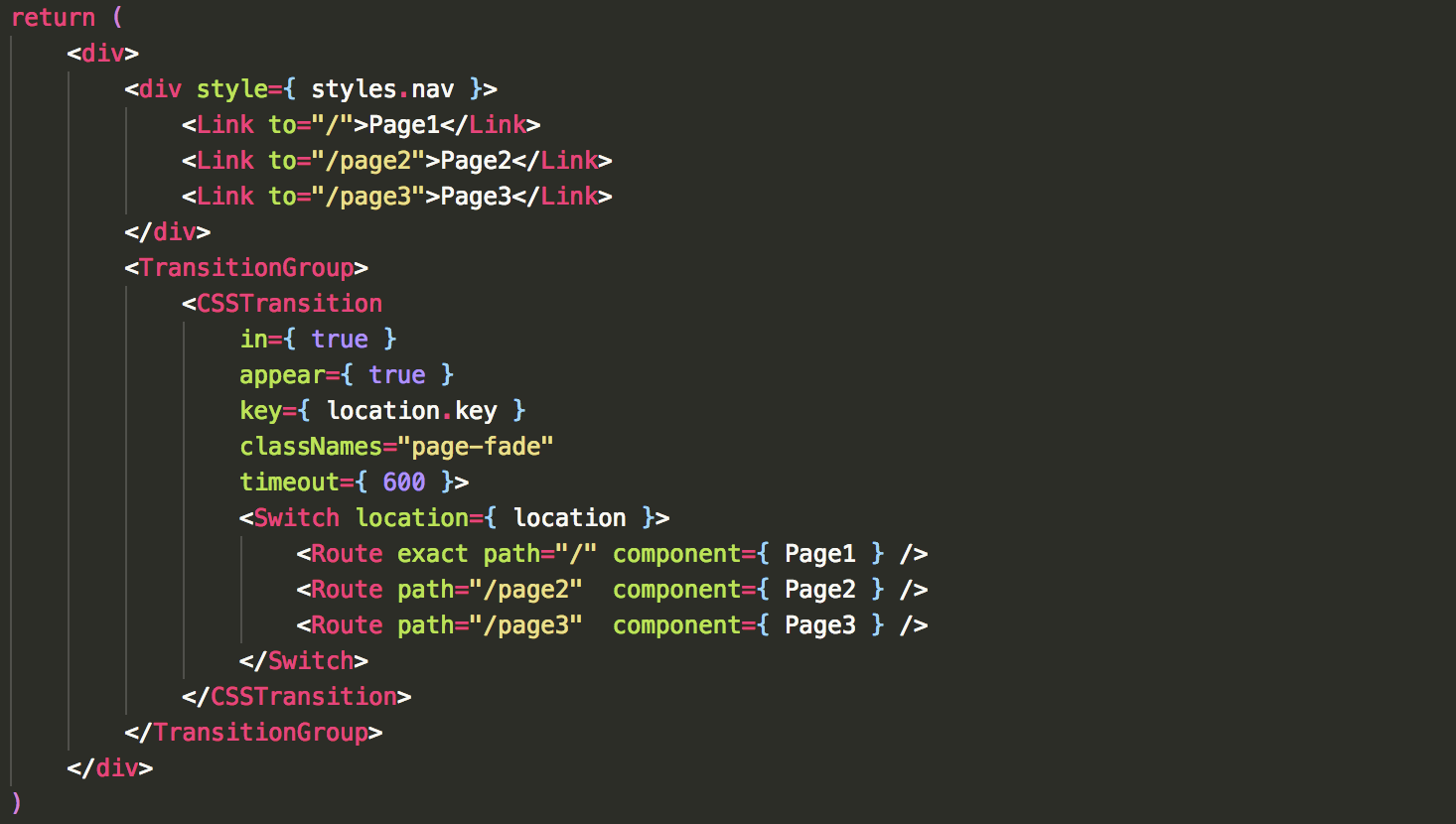
Notice we are giving the location.key as the key, and we are also providing the <Switch> statement with the location. This is important to make sure the exiting component transitions off correctly. Without this, the transition enter and exit is given to the new component rather than exiting the previous component and entering the new one.
Now we just need to write the page-fade transition. Here is the CSS for this:
.page-fade-appear {
    opacity: 0;
    position: absolute;
}

.page-fade-appear.page-fade-appear-active {
    opacity: 1;
    transition: opacity 300ms linear 300ms;
}

.page-fade-enter {
    opacity: 0;
    position: absolute;
}

.page-fade-enter.page-fade-enter-active {
    opacity: 1;
    transition: opacity 300ms linear 300ms;
}

.page-fade-exit {
    opacity: 1;
    position: absolute
}

.page-fade-exit.page-fade-exit-active {
    opacity: 0;
    transition: opacity 300ms linear;
}
On appear and enter we simple position the component absolutely with no opacity. The transition turns up the opacity to 1. The exit does the opposite. Notice the appear and enter transitions both wait 300ms before executing just to give the old component enough time to turn it's opacity all the way down.
You should now see your different routes independently transition in an out of the view!


