Bootstrap

Intro to Bootstrap
Bootstrap is a powerful front-end framework for faster and easier web development. It includes HTML and CSS based design templates for common user interface components like Typography, Forms, Buttons, Tables, Navigations, Dropdowns, Alerts, Modals, Tabs, Accordion, Carousel and many other as well as optional JavaScript extensions.
Bootstrap also gives you ability to create responsive layout with much less efforts.
The biggest advantage of using Bootstrap is that it comes with free set of tools for creating flexible and responsive web layouts as well as common interface components.
Additionally, using the Bootstrap data APIs you can create advance interface components like Scrollspy and Typeaheads without writing a single line of JavaScript.
Here are some more advantages, why one should opt for Bootstrap:
- Save lots of time — You can save lots of time and efforts using the
- Bootstrap predefined design templates and classes and concentrate on other development work.
- Responsive features — Using Bootstrap you can easily create responsive designs. Bootstrap responsive features make your web pages to appear more appropriately on different devices and screen resolutions without any change in markup.
- Consistent design — All Bootstrap components share the same design templates and styles through a central library, so that the designs and layouts of your web pages are consistent throughout your development.
- Easy to use — Bootstrap is very easy to use. Anybody with the basic working knowledge of HTML and CSS can start development with Bootstrap.
- Compatible with browsers — Bootstrap is created with modern browsers in mind and it is compatible with all modern browsers such as Mozilla Firefox, Google Chrome, Safari, Internet Explorer, and Opera.
Open Source — And the best part is, it is completely free to download and use.
Installation
Go to http://getbootstrap.com/ and download the files or use a cdn.
<link rel="stylesheet" href="https://maxcdn.bootstrapcdn.com/bootstrap/3.3.4/css/bootstrap.min.css">
Insert the HTML above into your <head></head>. This is all you need in order to start using bootstrap classes on your html.
The Grid System
By far the most important take away from this tutorial is using the bootstrap grid system. If you've ever built a website in the 90's you'd know how much of a pain it was to get things to line up nicely on the page. Frames, tables, absolute positioning, media queries...there were methods...it was so painful and tragic that it's hard for me to even talk about it. Now the most commonly used method of structuring your page is to use a framework for developing responsive websites, the most popular of which is Bootstrap.Grid systems are used for creating page layouts through a series of rows and columns that house your content. Here's how the Bootstrap grid system works:
- Rows must be placed within a .container (fixed-width) or .container-fluid (full-width) for proper alignment and padding.
- Use rows to create horizontal groups of columns.
- Content should be placed within columns, and only columns may be immediate children of rows.
- Predefined grid classes like .row and .col-xs-4 are available for quickly making grid layouts. Less mixins can also be used for more semantic layouts.
- Columns create gutters (gaps between column content) via padding. That padding is offset in rows for the first and last column via negative margin on .rows.
- The negative margin is why the examples below are outdented. It's so that content within grid columns is lined up with non-grid content.
- Grid columns are created by specifying the number of twelve available columns you wish to span. For example, three equal columns would use three .col-xs-4.
- If more than 12 columns are placed within a single row, each group of extra columns will, as one unit, wrap onto a new line.
- Grid classes apply to devices with screen widths greater than or equal to the breakpoint sizes, and override grid classes targeted at smaller devices. Therefore, e.g. applying any .col-md-* class to an element will not only affect its styling on medium devices but also on large devices if a .col-lg-* class is not present.
Containers
Bootstrap requires a containing element to wrap site contents and house our grid system. You may choose one of two containers to use in your projects. Note that, due to padding and more, neither container is nestable.
Use .container for a responsive fixed width container.
<div class="container">
  ...
</div>
Use .container-fluid for a full width container, spanning the entire width of your viewport.
<div class="container-fluid">
  ...
</div>
Rows and Columns

<div class="row">
  <div class="col-md-1">.col-md-1</div>
  <div class="col-md-1">.col-md-1</div>
  <div class="col-md-1">.col-md-1</div>
  <div class="col-md-1">.col-md-1</div>
  <div class="col-md-1">.col-md-1</div>
  <div class="col-md-1">.col-md-1</div>
  <div class="col-md-1">.col-md-1</div>
  <div class="col-md-1">.col-md-1</div>
  <div class="col-md-1">.col-md-1</div>
  <div class="col-md-1">.col-md-1</div>
  <div class="col-md-1">.col-md-1</div>
  <div class="col-md-1">.col-md-1</div>
</div>
<div class="row">
  <div class="col-md-8">.col-md-8</div>
  <div class="col-md-4">.col-md-4</div>
</div>
<div class="row">
  <div class="col-md-4">.col-md-4</div>
  <div class="col-md-4">.col-md-4</div>
  <div class="col-md-4">.col-md-4</div>
</div>
<div class="row">
  <div class="col-md-6">.col-md-6</div>
  <div class="col-md-6">.col-md-6</div>
</div>
Column Offset
Move columns to the right using .col-md-offset-* classes. These classes increase the left margin of a column by * columns. For example, .col-md-offset-4 moves .col-md-4 over four columns.

<div class="row">
  <div class="col-md-4">.col-md-4</div>
  <div class="col-md-4 col-md-offset-4">.col-md-4 .col-md-offset-4</div>
</div>
<div class="row">
  <div class="col-md-3 col-md-offset-3">.col-md-3 .col-md-offset-3</div>
  <div class="col-md-3 col-md-offset-3">.col-md-3 .col-md-offset-3</div>
</div>
<div class="row">
  <div class="col-md-6 col-md-offset-3">.col-md-6 .col-md-offset-3</div>
</div>
Nesting Columns
To nest your content with the default grid, add a new .row and set of .col-sm-* columns within an existing .col-sm-* column. Nested rows should include a set of columns that add up to 12 or fewer (it is not required that you use all 12 available columns).

<div class="row">
  <div class="col-sm-9">
    Level 1: .col-sm-9
    <div class="row">
      <div class="col-xs-8 col-sm-6">
        Level 2: .col-xs-8 .col-sm-6
      </div>
      <div class="col-xs-4 col-sm-6">
        Level 2: .col-xs-4 .col-sm-6
      </div>
    </div>
  </div>
</div>
Push and Pull
Easily change the order of our built-in grid columns with .col-md-push-* and .col-md-pull-* modifier classes.

<div class="row">
  <div class="col-md-9 col-md-push-3">.col-md-9 .col-md-push-3</div>
  <div class="col-md-3 col-md-pull-9">.col-md-3 .col-md-pull-9</div>
</div>
Apply What You've Learned
First draw a quick wire-frame design that we'll build using bootstrap:
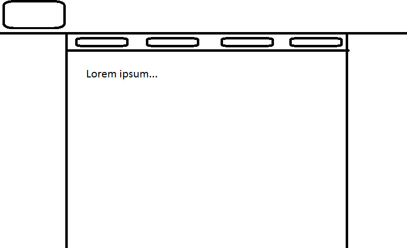
As you can see our design has a header, a navbar, and space on the right and left of the main content. Time to build!
Step 1: make the container. Face a choice: use container or container-fluid? we want the header to take up the whole screen, but we want the content to have padding. Decision: let's use both, first we'll build a container-fluid for the header and then we'll use a container for the navbar and the content. It's fine to have more than one container on a page, but it's NEVER okay to nest containers inside of each other.
<!-- header -->
<div class="container-fluid"></div>
<!-- navbar and content -->
<div class="container"></div>
Now lets's put a row for the content of the header, as well as rows for the navbar and the main content.
<div class="container-fluid">
	<div class="row"></div>
</div>
<div class="container">
	<div class="row"></div>
	<div class="row"></div>
</div>
Now we can add columns to those rows. We will never put content on our page without putting it within a col that's nested in a row, nested in a container.
<div class="container-fluid">
	<div class="row">
		<div class="col-sm-12"></div>
	</div>
</div>
<div class="container">
	<div class="row">
		<div class="col-sm-12"></div>
	</div>
	<div class="row">
		<div class="col-sm-12"></div>
	</div>
</div>
Great we've got our basic structure built, now let's add some styles so our page stops looking so 1-dimensional.
Bootstrap includes many useful classes that simply style your content, two of them are bg-primary and bg-info. Let's use those to give a color to our sections.

<div class="container-fluid">
	<div class="row">
		<div class="col-sm-12 bg-primary" style="height: 100px;">
			Header
		</div>
	</div>
</div>
<div class="container">
	<div class="row bg-info">
		<div class="col-sm-12" style="height:50px;">
			Navbar
		</div>
	</div>
	<div class="row bg-primary" style="height:350px;">
		<div class="col-sm-12">
			Content
		</div>
	</div>
</div>
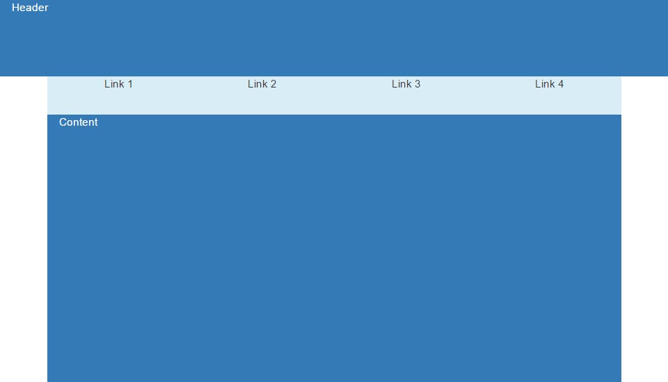
Now according to our wire-frame, we have 4 menu options that are evenly spaced. It's time to nest a row and 4 columns inside of our navbar column.
<div class="container">
	<div class="row bg-info">
		<div class="col-sm-12" style="height:50px;">
			<div class="row">
				<div class="col-sm-3" style="text-align: center;">Link 1</div>
				<div class="col-sm-3" style="text-align: center;">Link 2</div>
				<div class="col-sm-3" style="text-align: center;">Link 3</div>
				<div class="col-sm-3" style="text-align: center;">Link 4</div>
			</div>
		</div>
	</div>
	<div class="row bg-primary" style="height:350px;">
		<div class="col-sm-12">
			Content
		</div>
	</div>
</div>
And ta-da! We're finished! Now you should have a pretty good understanding of how to use the Bootstrap grid system.
Forms
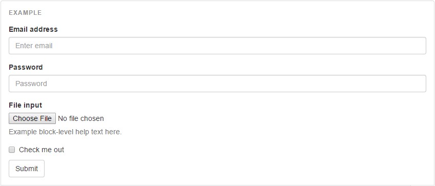
Individual form controls automatically receive some global styling. All textual <input>, <textarea>, and <select> elements with .form-control are set to width: 100%; by default. Wrap labels and controls in .form-group for optimum spacing.
<form>
  <div class="form-group">
    <label for="exampleInputEmail1">Email address</label>
    <input type="email" class="form-control" id="exampleInputEmail1" placeholder="Enter email">
  </div>
  <div class="form-group">
    <label for="exampleInputPassword1">Password</label>
    <input type="password" class="form-control" id="exampleInputPassword1" placeholder="Password">
  </div>
  <div class="form-group">
    <label for="exampleInputFile">File input</label>
    <input type="file" id="exampleInputFile">
    <p class="help-block">Example block-level help text here.</p>
  </div>
  <div class="checkbox">
    <label>
      <input type="checkbox"> Check me out
    </label>
  </div>
  <button type="submit" class="btn btn-default">Submit</button>
</form>
Inline Forms
Add .form-inline to your form (which doesn't have to be a <form>) for left-aligned and inline-block controls. This only applies to forms within viewports that are at least 768px wide.

<form class="form-inline">
  <div class="form-group">
    <label for="exampleInputName2">Name</label>
    <input type="text" class="form-control" id="exampleInputName2" placeholder="Jane Doe">
  </div>
  <div class="form-group">
    <label for="exampleInputEmail2">Email</label>
    <input type="email" class="form-control" id="exampleInputEmail2" placeholder="jane.doe@example.com">
  </div>
  <button type="submit" class="btn btn-default">Send invitation</button>
</form>
Horizontal Forms
Use Bootstrap's predefined grid classes to align labels and groups of form controls in a horizontal layout by adding .form-horizontal to the form (which doesn't have to be a <form>). Doing so changes .form-groups to behave as grid rows, so no need for .row.

<form class="form-horizontal">
  <div class="form-group">
    <label for="inputEmail3" class="col-sm-2 control-label">Email</label>
    <div class="col-sm-10">
      <input type="email" class="form-control" id="inputEmail3" placeholder="Email">
    </div>
  </div>
  <div class="form-group">
    <label for="inputPassword3" class="col-sm-2 control-label">Password</label>
    <div class="col-sm-10">
      <input type="password" class="form-control" id="inputPassword3" placeholder="Password">
    </div>
  </div>
  <div class="form-group">
    <div class="col-sm-offset-2 col-sm-10">
      <div class="checkbox">
        <label>
          <input type="checkbox"> Remember me
        </label>
      </div>
    </div>
  </div>
  <div class="form-group">
    <div class="col-sm-offset-2 col-sm-10">
      <button type="submit" class="btn btn-default">Sign in</button>
    </div>
  </div>
</form>
Static Forms
When you need to place plain text next to a form label within a form, use the .form-control-static class on a <p>.
<form class="form-horizontal">
  <div class="form-group">
    <label class="col-sm-2 control-label">Email</label>
    <div class="col-sm-10">
      <p class="form-control-static">email@example.com</p>
    </div>
  </div>
  <div class="form-group">
    <label for="inputPassword" class="col-sm-2 control-label">Password</label>
    <div class="col-sm-10">
      <input type="password" class="form-control" id="inputPassword" placeholder="Password">
    </div>
  </div>
</form>
Disabled Inputs
Add the disabled boolean attribute on an input to prevent user interactions. Disabled inputs appear lighter and add a not-allowed cursor.
<input class="form-control" id="disabledInput" type="text" placeholder="Disabled input here..." disabled>
Readonly Inputs
Add the readonly boolean attribute on an input to prevent modification of the input's value. Read-only inputs appear lighter (just like disabled inputs), but retain the standard cursor.
<input class="form-control" type="text" placeholder="Readonly input here…" readonly>
Validation Styling
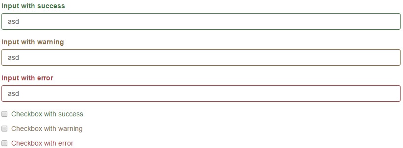
Bootstrap includes validation styles for error, warning, and success states on form controls. To use, add .has-warning, .has-error, or .has-success to the parent element. Any .control-label, .form-control, and .help-block within that element will receive the validation styles.
<div class="form-group has-success">
  <label class="control-label" for="inputSuccess1">Input with success</label>
  <input type="text" class="form-control" id="inputSuccess1">
</div>
<div class="form-group has-warning">
  <label class="control-label" for="inputWarning1">Input with warning</label>
  <input type="text" class="form-control" id="inputWarning1">
</div>
<div class="form-group has-error">
  <label class="control-label" for="inputError1">Input with error</label>
  <input type="text" class="form-control" id="inputError1">
</div>
<div class="has-success">
  <div class="checkbox">
    <label>
      <input type="checkbox" id="checkboxSuccess" value="option1">
      Checkbox with success
    </label>
  </div>
</div>
<div class="has-warning">
  <div class="checkbox">
    <label>
      <input type="checkbox" id="checkboxWarning" value="option1">
      Checkbox with warning
    </label>
  </div>
</div>
<div class="has-error">
  <div class="checkbox">
    <label>
      <input type="checkbox" id="checkboxError" value="option1">
      Checkbox with error
    </label>
  </div>
</div>
Validation Icons
You can also add optional feedback icons with the addition of .has-feedback and the right icon.
Feedback icons only work with textual <input class="form-control"> elements.
![]()
<div class="form-group has-success has-feedback">
  <label class="control-label" for="inputSuccess2">Input with success</label>
  <input type="text" class="form-control" id="inputSuccess2" aria-describedby="inputSuccess2Status">
  <span class="glyphicon glyphicon-ok form-control-feedback" aria-hidden="true"></span>
  <span id="inputSuccess2Status" class="sr-only">(success)</span>
</div>
<div class="form-group has-warning has-feedback">
  <label class="control-label" for="inputWarning2">Input with warning</label>
  <input type="text" class="form-control" id="inputWarning2" aria-describedby="inputWarning2Status">
  <span class="glyphicon glyphicon-warning-sign form-control-feedback" aria-hidden="true"></span>
  <span id="inputWarning2Status" class="sr-only">(warning)</span>
</div>
<div class="form-group has-error has-feedback">
  <label class="control-label" for="inputError2">Input with error</label>
  <input type="text" class="form-control" id="inputError2" aria-describedby="inputError2Status">
  <span class="glyphicon glyphicon-remove form-control-feedback" aria-hidden="true"></span>
  <span id="inputError2Status" class="sr-only">(error)</span>
</div>
<div class="form-group has-success has-feedback">
  <label class="control-label" for="inputGroupSuccess1">Input group with success</label>
  <div class="input-group">
    <span class="input-group-addon">@</span>
    <input type="text" class="form-control" id="inputGroupSuccess1" aria-describedby="inputGroupSuccess1Status">
  </div>
  <span class="glyphicon glyphicon-ok form-control-feedback" aria-hidden="true"></span>
  <span id="inputGroupSuccess1Status" class="sr-only">(success)</span>
</div>
Input Sizes
Set heights using classes like .input-lg, and set widths using grid column classes like .col-lg-*. Create taller or shorter form controls that match button sizes.
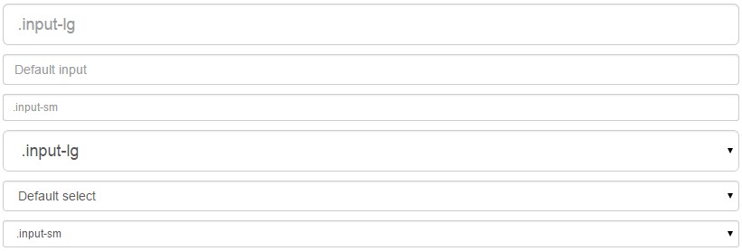
<input class="form-control input-lg" type="text" placeholder=".input-lg">
<input class="form-control" type="text" placeholder="Default input">
<input class="form-control input-sm" type="text" placeholder=".input-sm">

<select class="form-control input-lg">...</select>
<select class="form-control">...</select>
<select class="form-control input-sm">...</select>
Input Widths
Wrap inputs in grid columns, or any custom parent element, to easily enforce desired widths.

<div class="row">
  <div class="col-xs-2">
    <input type="text" class="form-control" placeholder=".col-xs-2">
  </div>
  <div class="col-xs-3">
    <input type="text" class="form-control" placeholder=".col-xs-3">
  </div>
  <div class="col-xs-4">
    <input type="text" class="form-control" placeholder=".col-xs-4">
  </div>
</div>
Help Text
Block level help text for form controls.

<label class="sr-only" for="inputHelpBlock">Input with help text</label>
<input type="text" id="inputHelpBlock" class="form-control" aria-describedby="helpBlock">
...
<span id="helpBlock" class="help-block">A block of help text that breaks onto a new line and may extend beyond one line.</span>
Use the button classes on an <a>, <button>, or <input> element.

<a class="btn btn-default" href="#" role="button">Link</a>
<button class="btn btn-default" type="submit">Button</button>
<input class="btn btn-default" type="button" value="Input">
<input class="btn btn-default" type="submit" value="Submit">
Use any of the available button classes to quickly create a styled button.

<!-- Standard button -->
<button type="button" class="btn btn-default">Default</button>

<!-- Provides extra visual weight and identifies the primary action in a set of buttons -->
<button type="button" class="btn btn-primary">Primary</button>

<!-- Indicates a successful or positive action -->
<button type="button" class="btn btn-success">Success</button>

<!-- Contextual button for informational alert messages -->
<button type="button" class="btn btn-info">Info</button>

<!-- Indicates caution should be taken with this action -->
<button type="button" class="btn btn-warning">Warning</button>

<!-- Indicates a dangerous or potentially negative action -->
<button type="button" class="btn btn-danger">Danger</button>

<!-- Deemphasize a button by making it look like a link while maintaining button behavior -->
<button type="button" class="btn btn-link">Link</button>
Fancy larger or smaller buttons? Add .btn-lg, .btn-sm, or .btn-xs for additional sizes.
Add the disabled attribute to <button> buttons.
Images
Images in Bootstrap 3 can be made responsive-friendly via the addition of the .img-responsive class. This applies max-width: 100%;, height: auto; and display: block; to the image so that it scales nicely to the parent element.
To center images which use the .img-responsive class, use .center-block instead of .text-center.
<img src="..." class="img-responsive" alt="Responsive image">
Image Shapes
Add classes to an element to easily style images in any project.
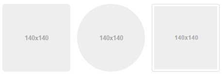
<img src="..." alt="..." class="img-rounded">
<img src="..." alt="..." class="img-circle">
<img src="..." alt="..." class="img-thumbnail">
Tables
For basic styling—light padding and only horizontal dividers—add the base class .table to any <table>. It may seem super redundant, but given the widespread use of tables for other plugins like calendars and date pickers, we've opted to isolate our custom table styles.

<table class="table">
  ...
</table>
Use .table-striped to add zebra-striping to any table row within the <tbody>.

<table class="table table-striped">
  ...
</table>
Add .table-bordered for borders on all sides of the table and cells.
Add .table-hover to enable a hover state on table rows within a <tbody>.
Add .table-condensed to make tables more compact by cutting cell padding in half.
Use contextual classes to color table rows or individual cells.
Create responsive tables by wrapping any .table in .table-responsive to make them scroll horizontally on small devices (under 768px). When viewing on anything larger than 768px wide, you will not see any difference in these tables.
Glyphicons
Bootstrap includes over a dozen reusable components built to provide iconography, dropdowns, input groups, navigation, alerts, and much more.
For performance reasons, all icons require a base class and individual icon class. To use, place the following code just about anywhere. Be sure to leave a space between the icon and text for proper padding.
Icon classes cannot be directly combined with other components. They should not be used along with other classes on the same element. Instead, add a nested and apply the icon classes to the <span>.
Icon classes should only be used on elements that contain no text content and have no child elements.
<span class="glyphicon glyphicon-search" aria-hidden="true"></span>
